Make-Up for Walls; foundation-coloured interior paint in skin tones.
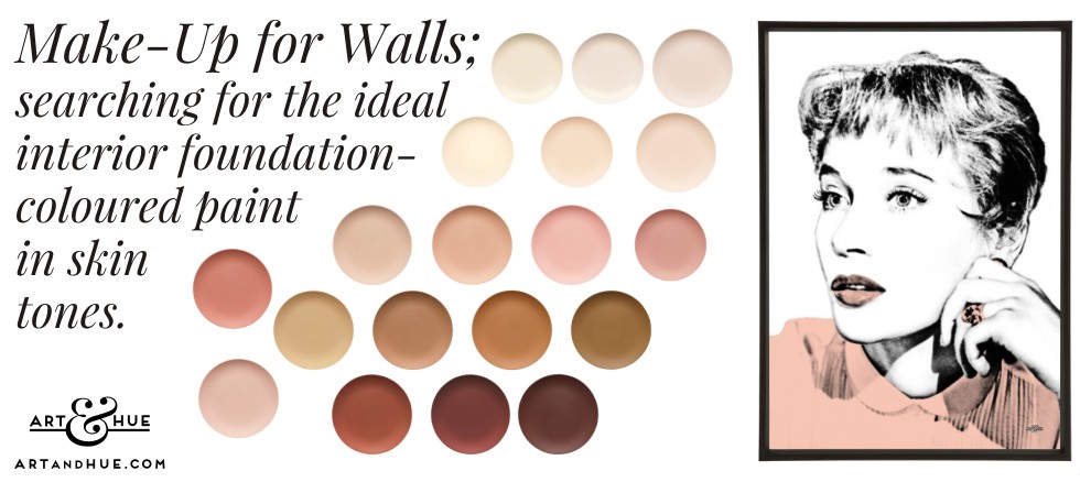
Wall Makeup; hunting for the ideal skin tone interior paint.
There’s been a real shift towards plaster shades and warm dusty peaches in recent years and it suddenly dawned that, like the situation here at Chez Art & Hue HQ right now, it may be because people are hunting for just the right shade of skin tone.
Make-up foundations are meant to correct and smooth, hide imperfections, and provide flattering coverage – and don’t we want our interior paints to do the same in many ways?
There are many paint companies producing shades in skin tones (euphemistically called “plasters” and “blushes”) but ultimately the move towards shades that resemble makeup foundations must surely be because we want a flattering skin tone on the wall.
Trying to steer clear of the word “flesh”-toned (as that conjures up the sleazy image of scratchy nylons), what could be more dreamily romantic, dare we say sexier, than peachy beige or warm cinnamon decor?
There will be shades that can encompass most of the world’s population so, if a makeup brand out there wants to collaborate with a paint manufacturer to produce a range of foundation-coloured emulsions, it could not come soon enough.
Thinking about it, it’s hard to believe that a make-up company hasn’t already previously collaborated with a paint maker to create a range of eggshells based on the colours of their foundations – all makeup brands have their loyal customers who adore their products & colours so surely some would want to match their tone to their walls?
What could be more alluring or glamourous (yes, sticking with the traditional British spelling so as not to take “u” away from glamour) than a room in the same tone as your own skin? A bedroom in the same plastery blush beige that matches your own skin tone screams glamour and luxury. Layer up and accessorise with colours from your own makeup or skin colouring palette (burnished lamps, terracotta bedlinen, a lipstick red or coral chair, and even plum or aqua eye-shadow curtains or blinds), and you’ve got a bedroom that’s tailored purely to you.
And if you find the right colour to flatter your skin, it can bounce off the walls to provide a glowing reflection, like Claybrook’s Montagu perhaps, which is a creamy soft peachy beige, and their Harvest Festival is the closest thing to YSL’s luminescent Touche éclat in a 5 litre tub.
Until such time that Estée Lauder, Charlotte Tilbury or Beauty Pie decide to collaborate with Little Greene, YesColours or Fenwick & Tilbrook, here’s a round-up of paints that resemble skin tones and foundations, and where you can order samples of them, to find just the right shade of wall make-up.
Browse the pink, red, peach, brown, neutral, and yellow sections of these paint companies to find your ideal colour match.
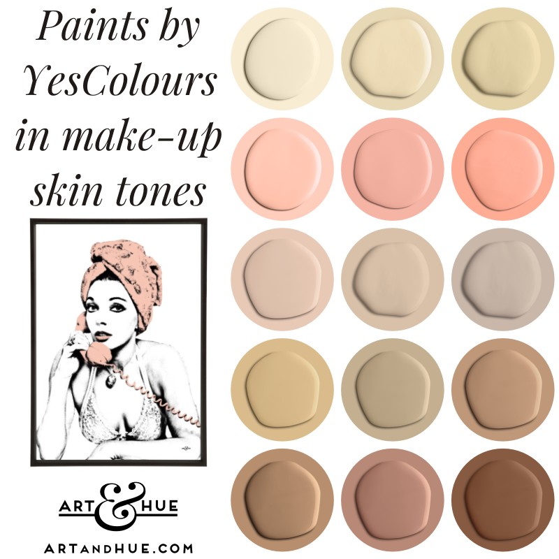
YesColours
A good starting point is their collection of peach tones (Restful Peach, Nostalgic Peach and Dirty Peach in particular) as well as their yellows, like Nostalgic Yellow and Restful yellow, which look as creamy as foundations. Nostalgic Pink is a great shade too and their brighter reds and pinks can act as lipstick and blusher tones.
Visit YesColours to browse.
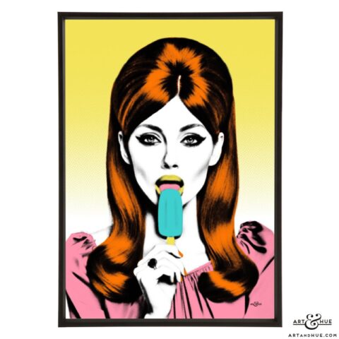
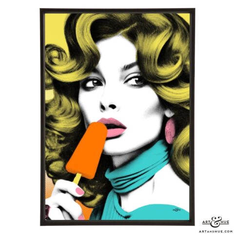
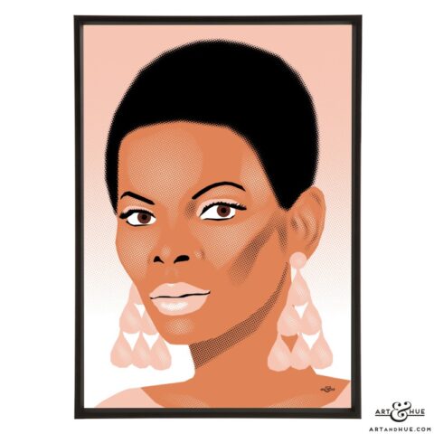
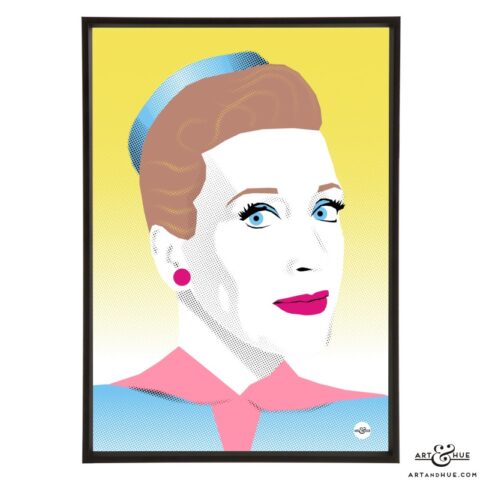
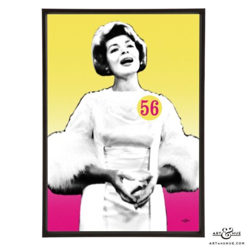
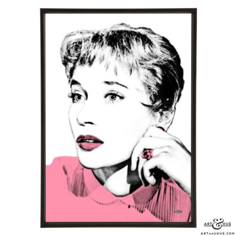
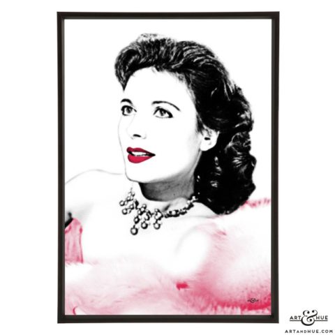
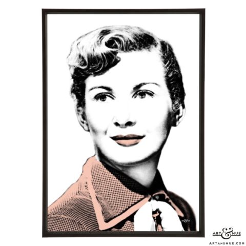
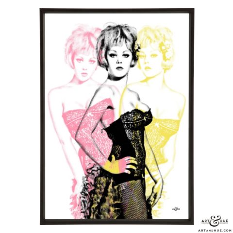
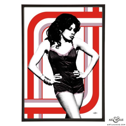
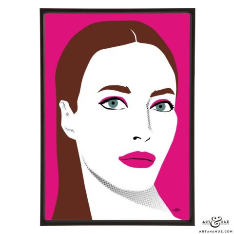
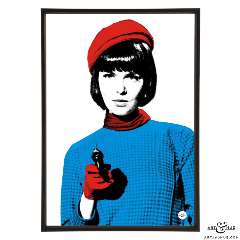
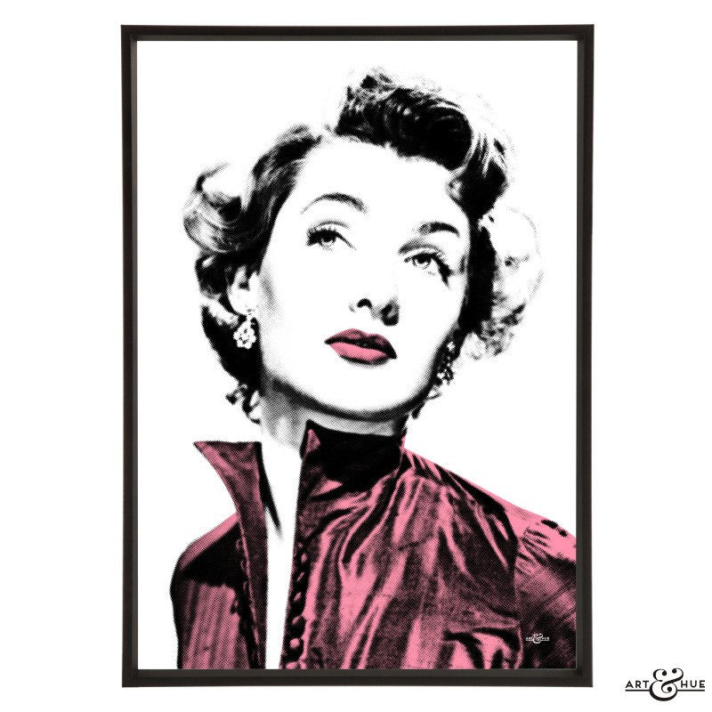
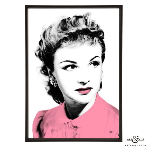
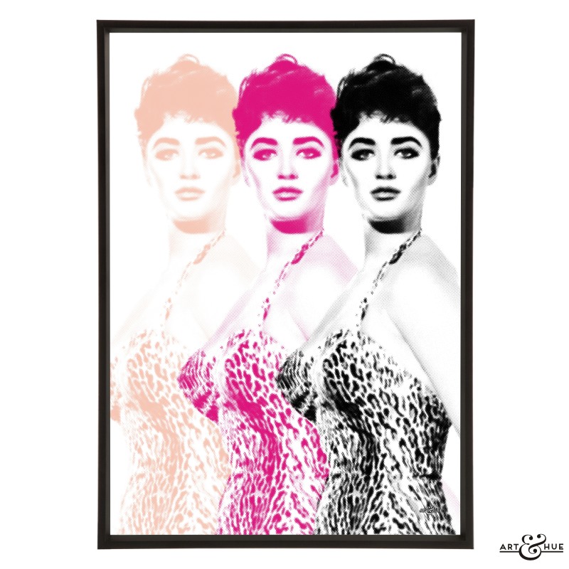
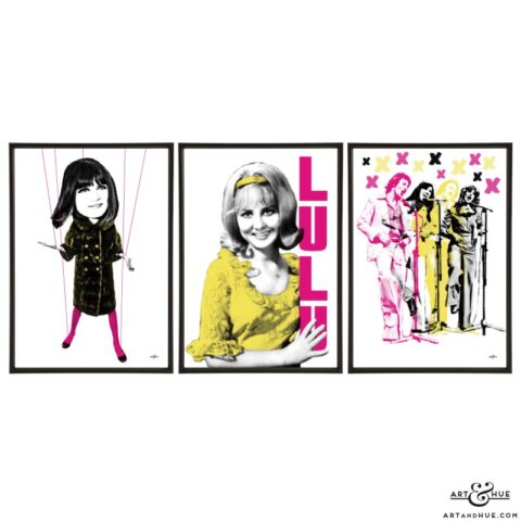
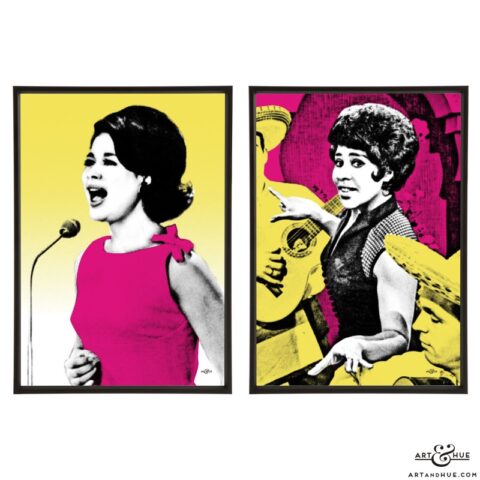
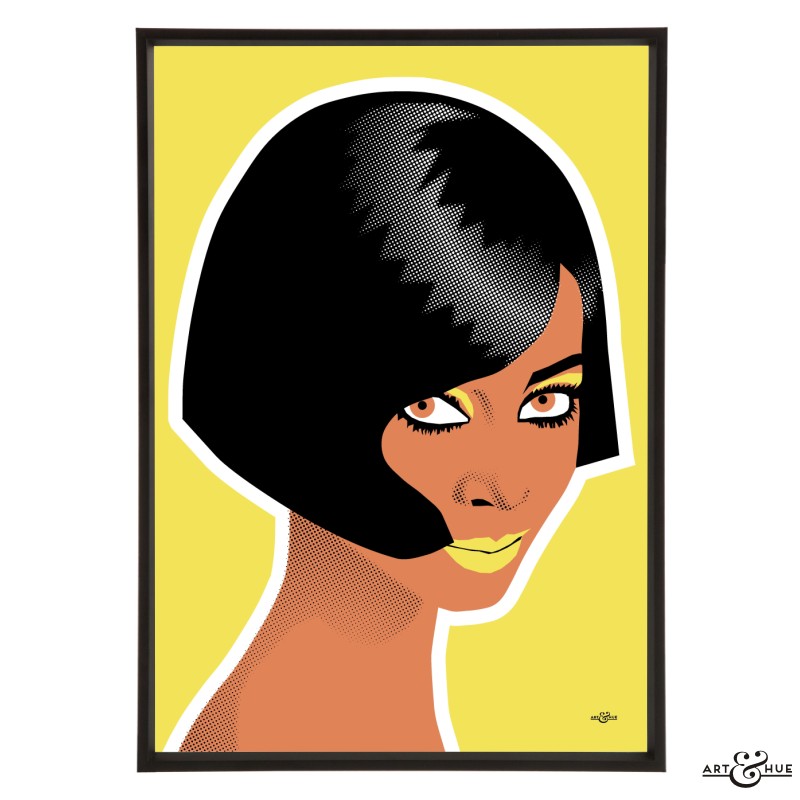
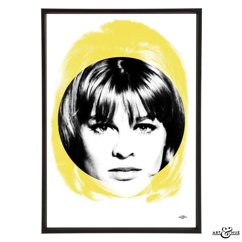
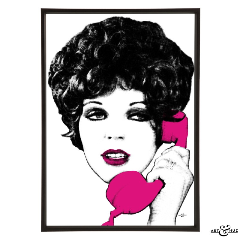
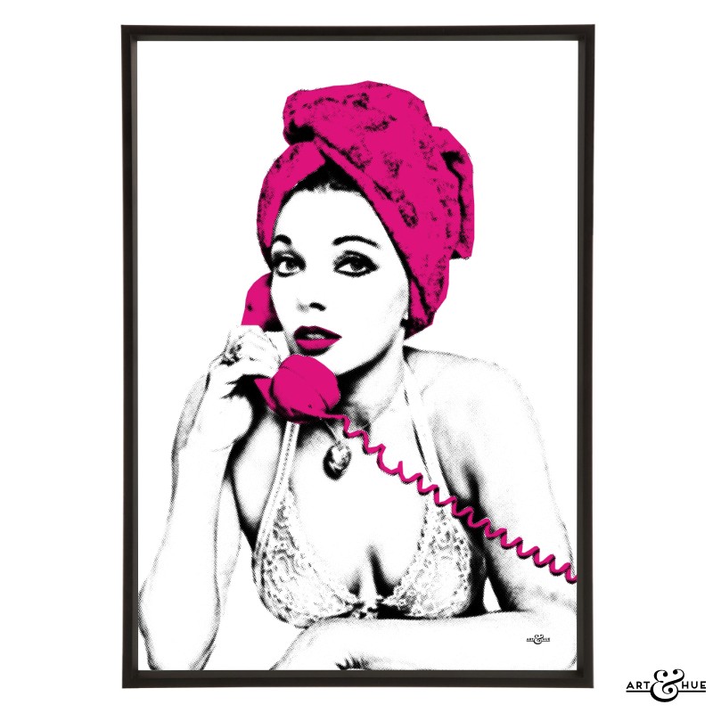
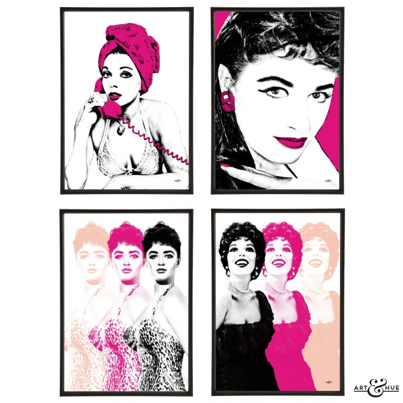
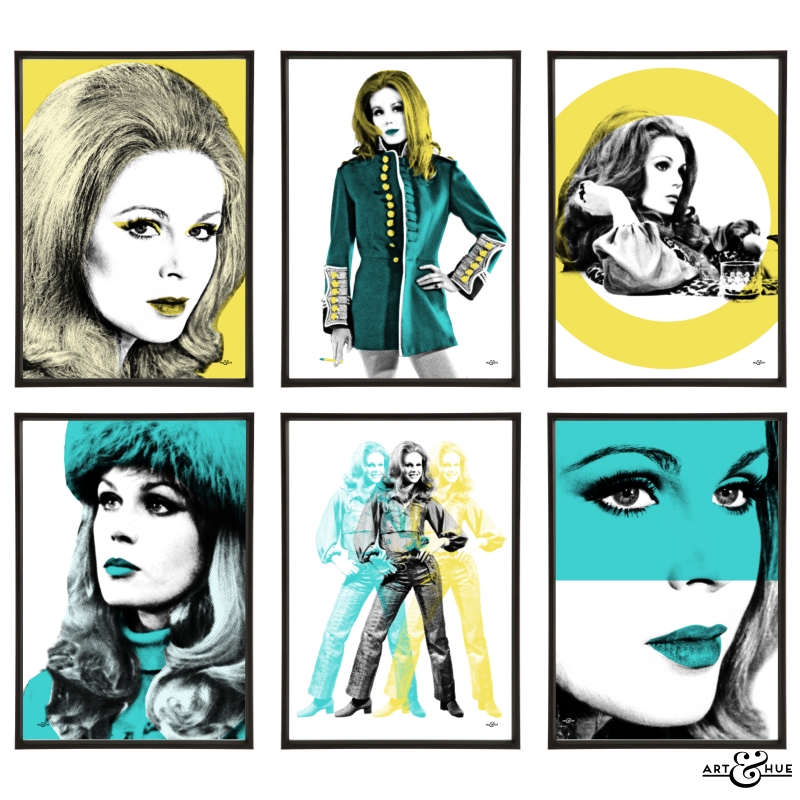
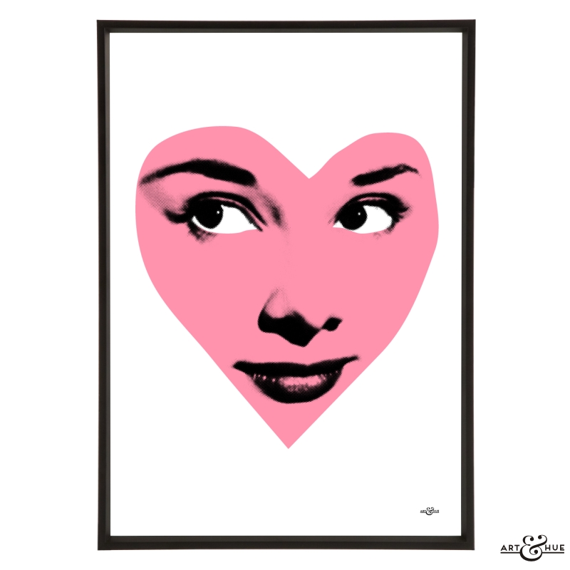
Pop art print pictured is of Joan Calling from the Joan Collins collection in Blush.
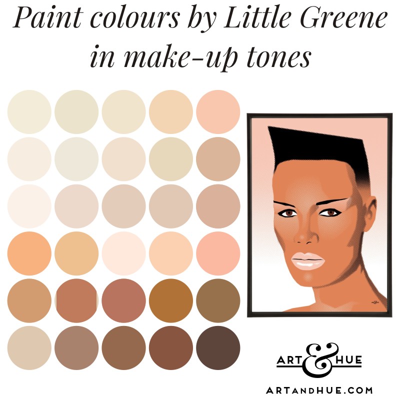
Little Greene
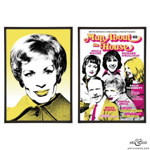
British paint manufacturer Little Greene are well known for their pinks, with many shades available in a sliding scale of graduated tones which vary in intensity.
Start by investigating their current card shades of Masquerade colours (available in full fat, Mid, & Light strengths, along with Julie’s Dream), as well as their Travertine and Beauvais Lilac shades.
There are also many great archive colours you can order sample pots of, including Light Wicker, Shrimp Pink, and 50s Magnolia.
Visit Little Greene to take a look.
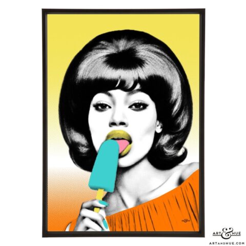
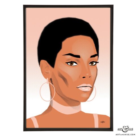
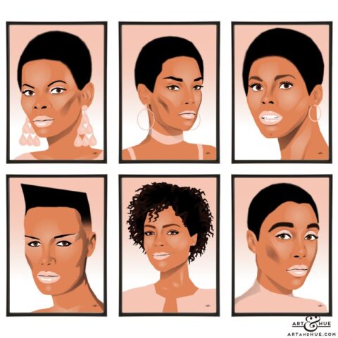
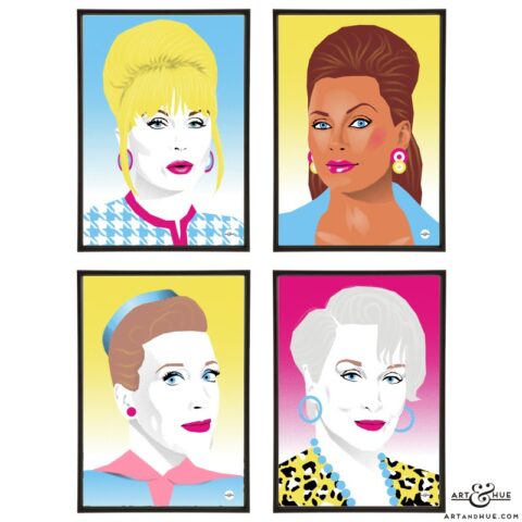
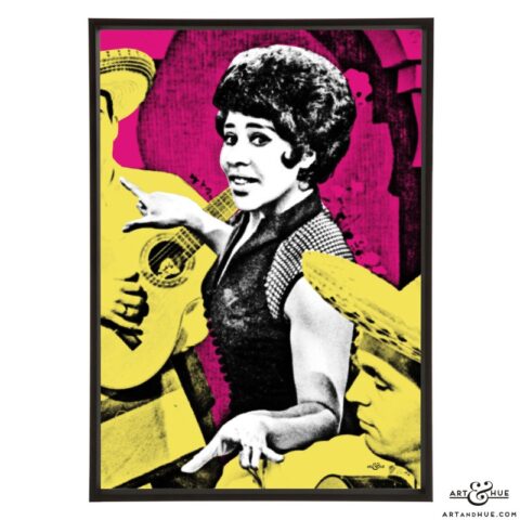
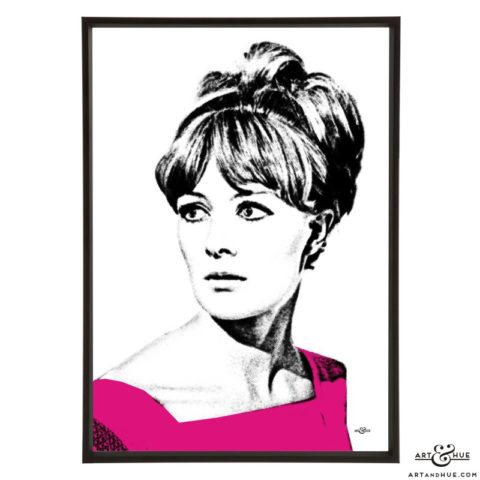
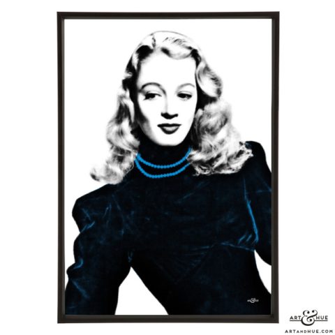
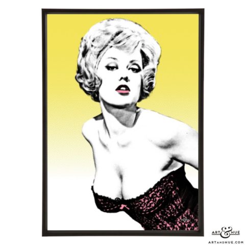
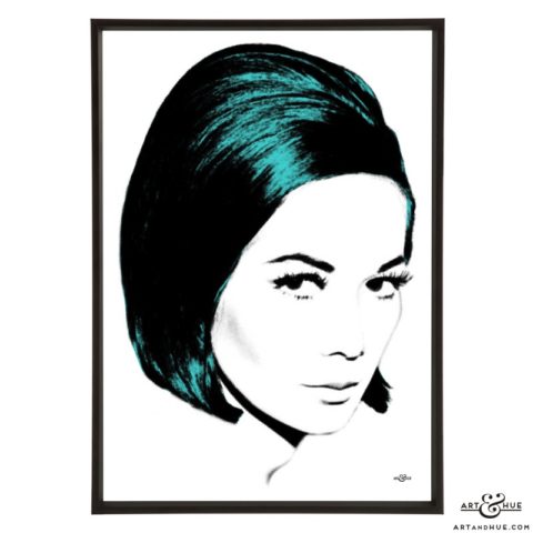
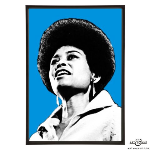
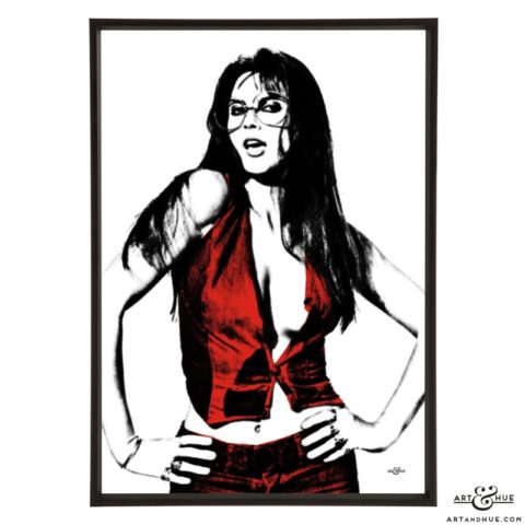
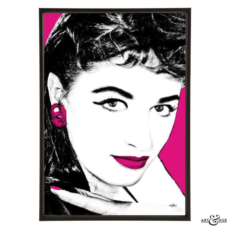
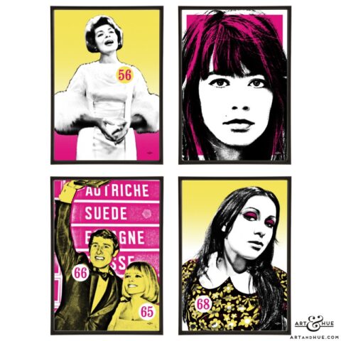
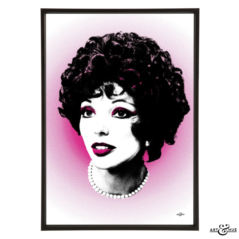
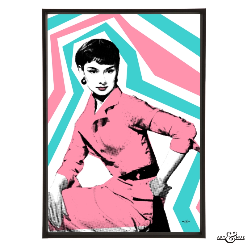
Pop art print pictured is of Grace Jones from the Black Women of Bond collection in Blush.
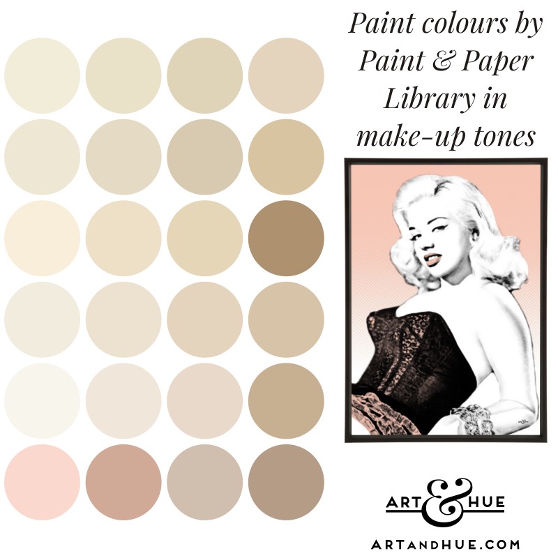
Paint & Paper Library
Paint & Paper Library have a great selection of colours on a chromatic scale so you can mix and match them, in one room or across a whole property, and know that they’ll all work together.
In colours similar to makeup foundation, their Powder, Plaster, Canvas, Leather, Paper, Cashmere, and Sand all come in five shades each so you can go as light or deep as you want.
With the new addition of Rose Cluster in their recently-launched Jewels collection, there are plenty of pinks to find the ideal blusher shade too.
Visit Paint & Paper Library to see more.
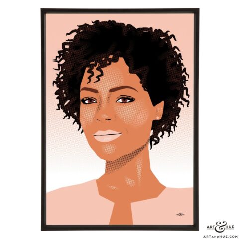
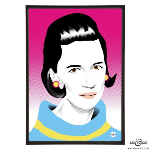
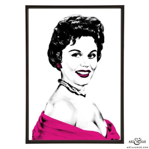
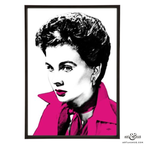
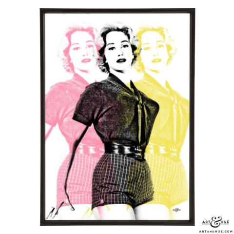
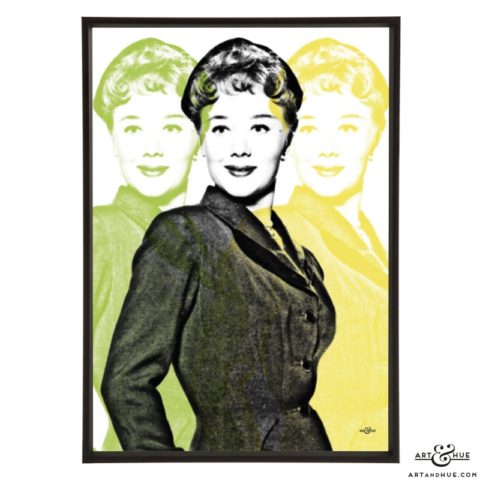
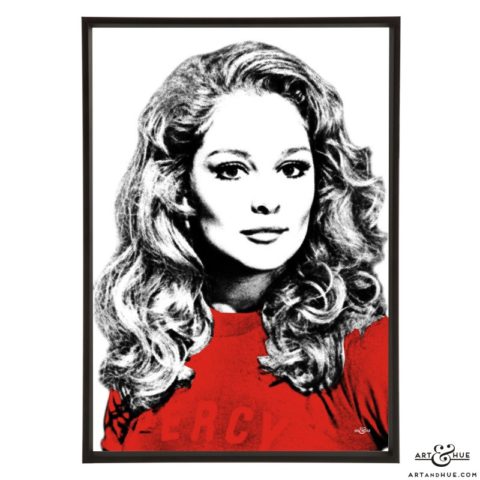
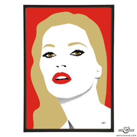
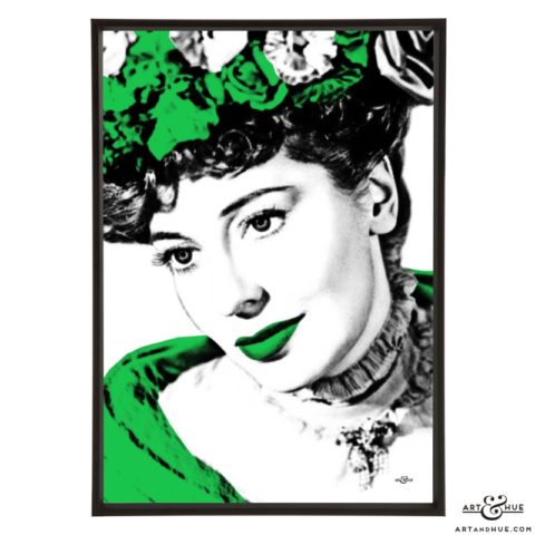
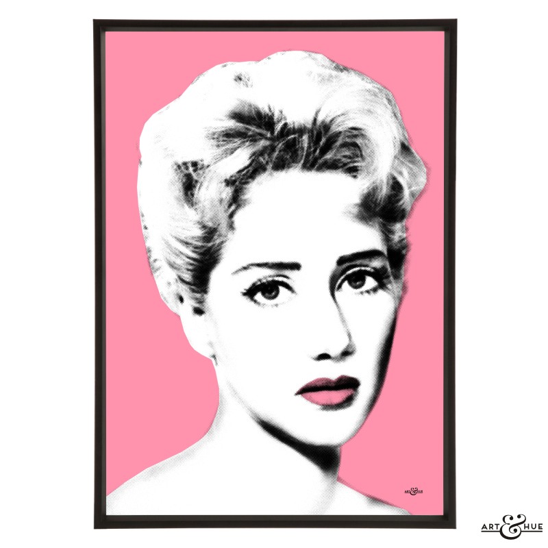
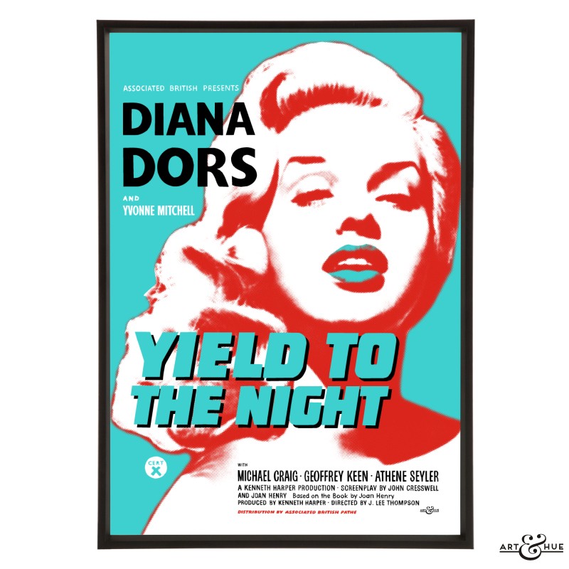
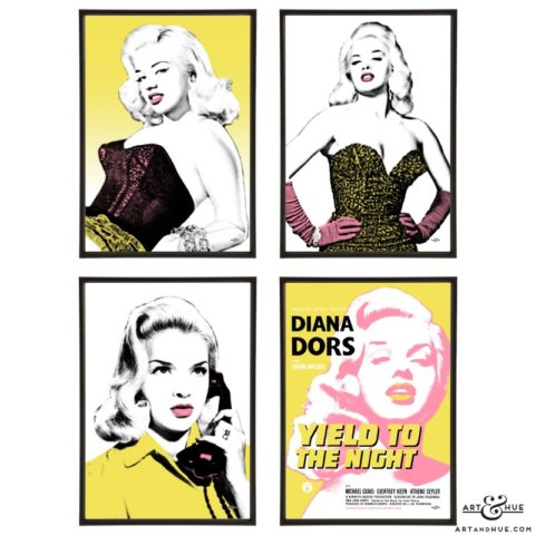
Pop art print pictured is of Diana Dors from the British Blonde Bombshells collection in Blush.
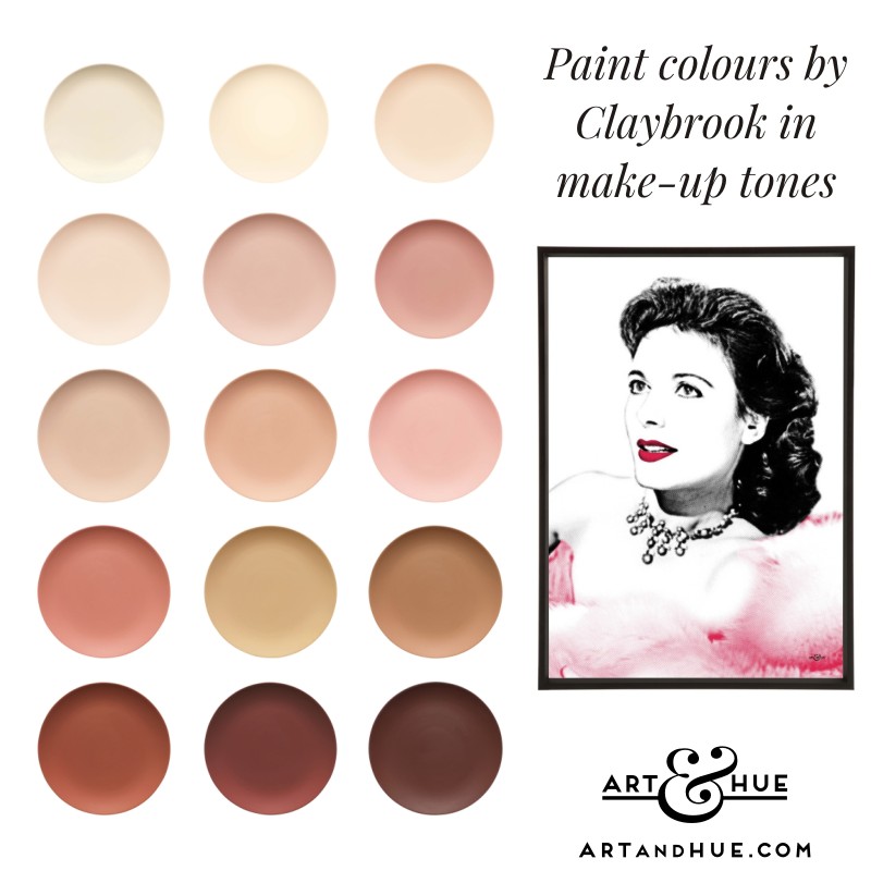
Claybrook
Known for their wall and floor tiles, Claybrook introduced a range of paint colours to coordinate with their wide range of bathroom and kitchen tiles.
Whilst it’s not the largest paint collection mentioned here, it’s incredibly focused with great colours to choose from.
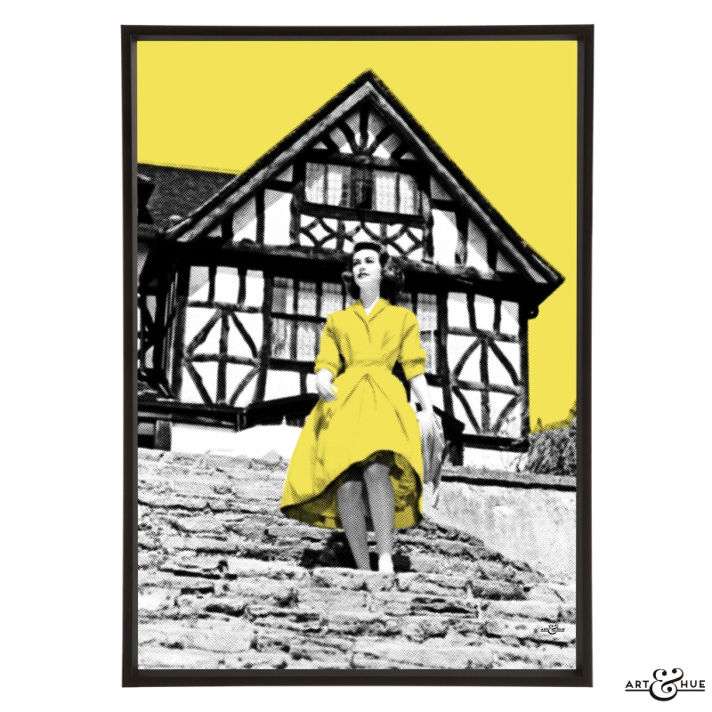
Browse their soft pinks and beiges, like Harvest Festival & Powderpuff (both would reflect a flattering glow), and their richer skin shades of Montagu, Isabel’s Bloom, and Cinnamon Roll (like a suntan in paint form).
Visit Claybrook to explore.
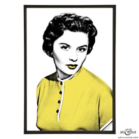
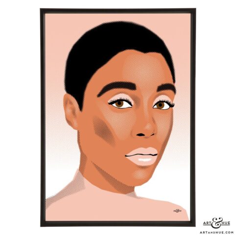
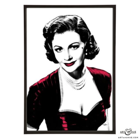
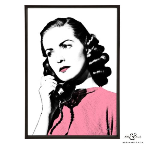
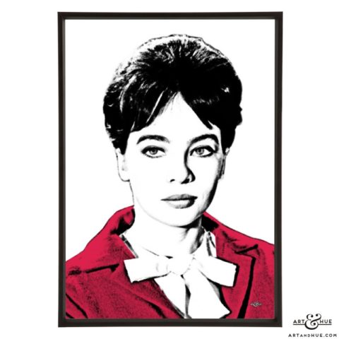
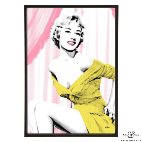
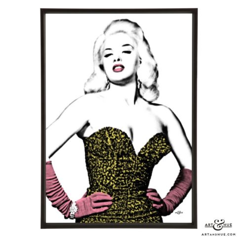
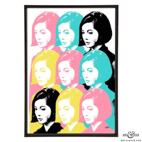
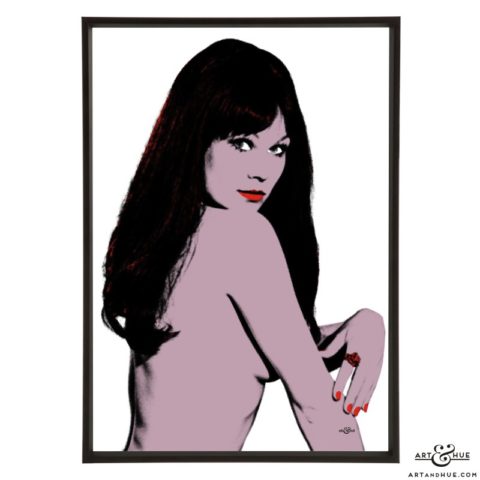
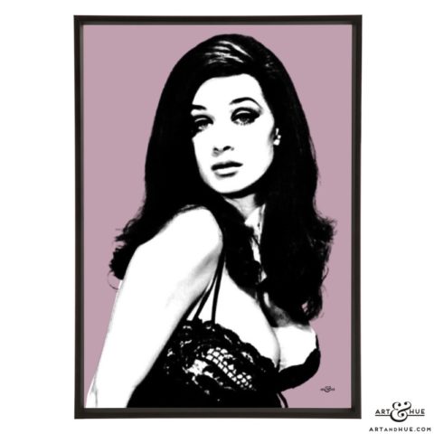
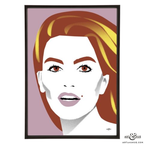
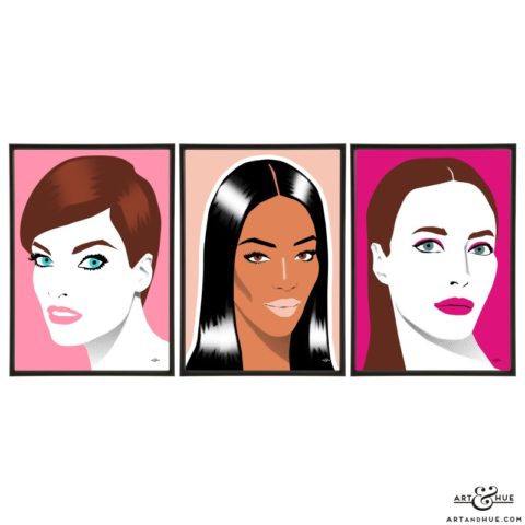
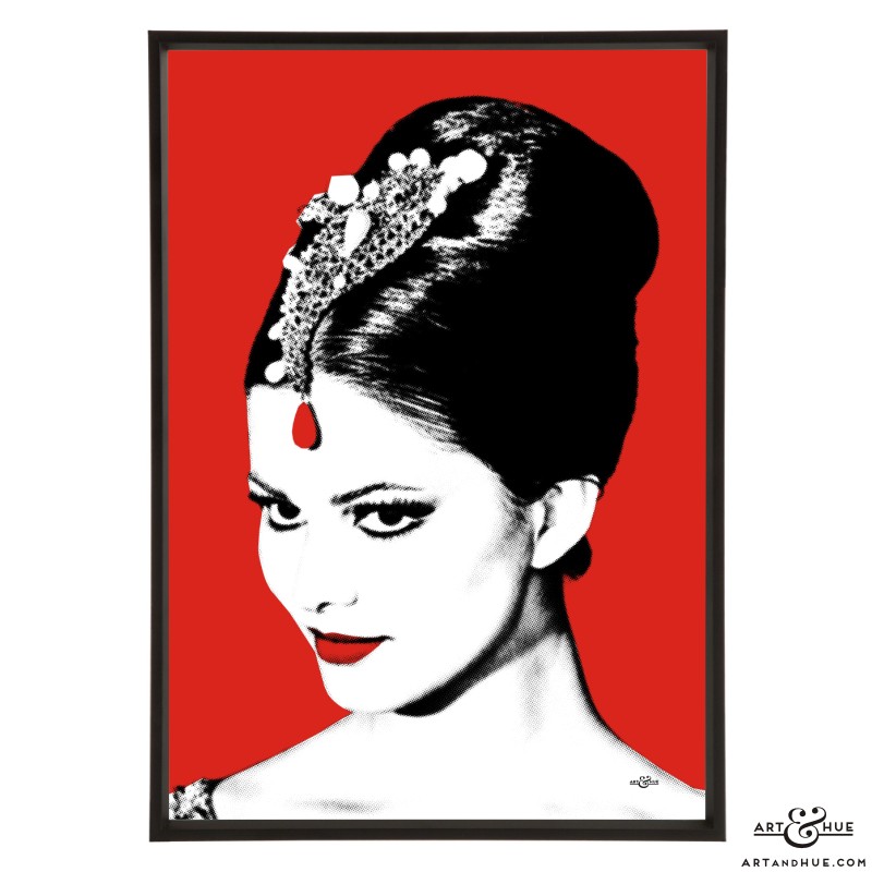
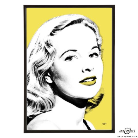
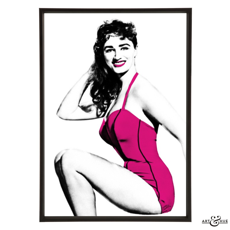
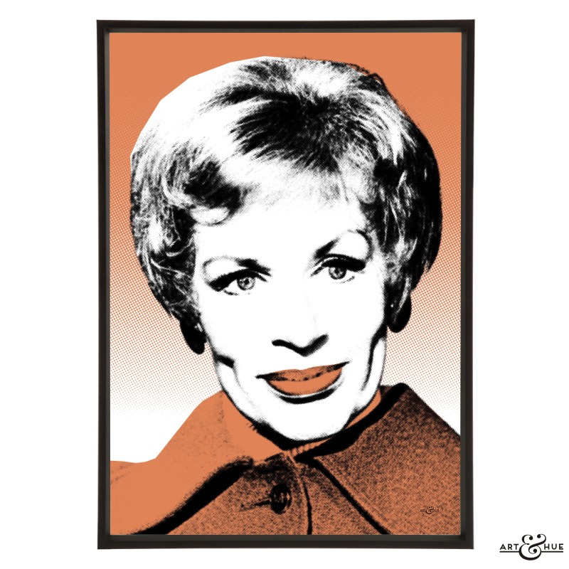
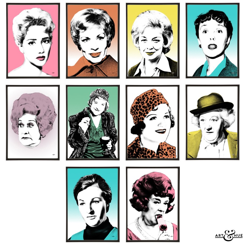
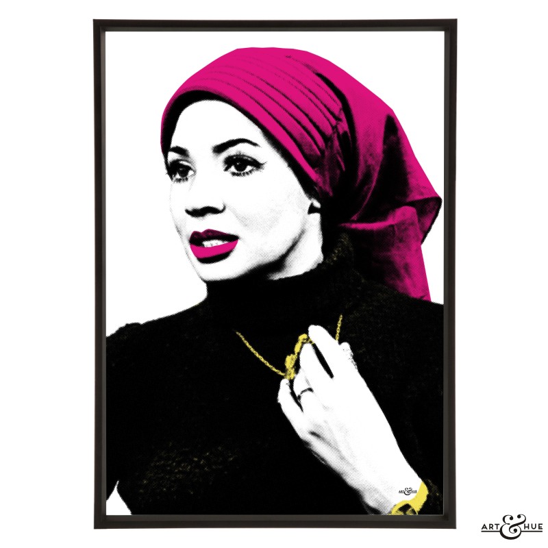
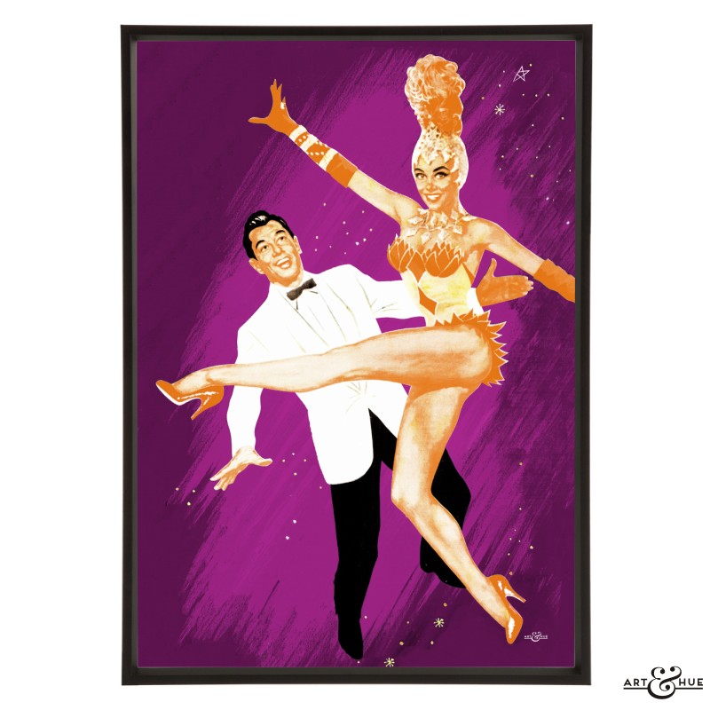
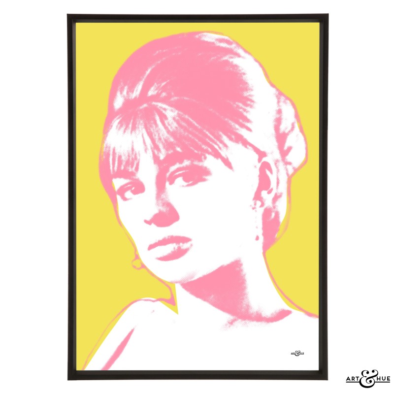
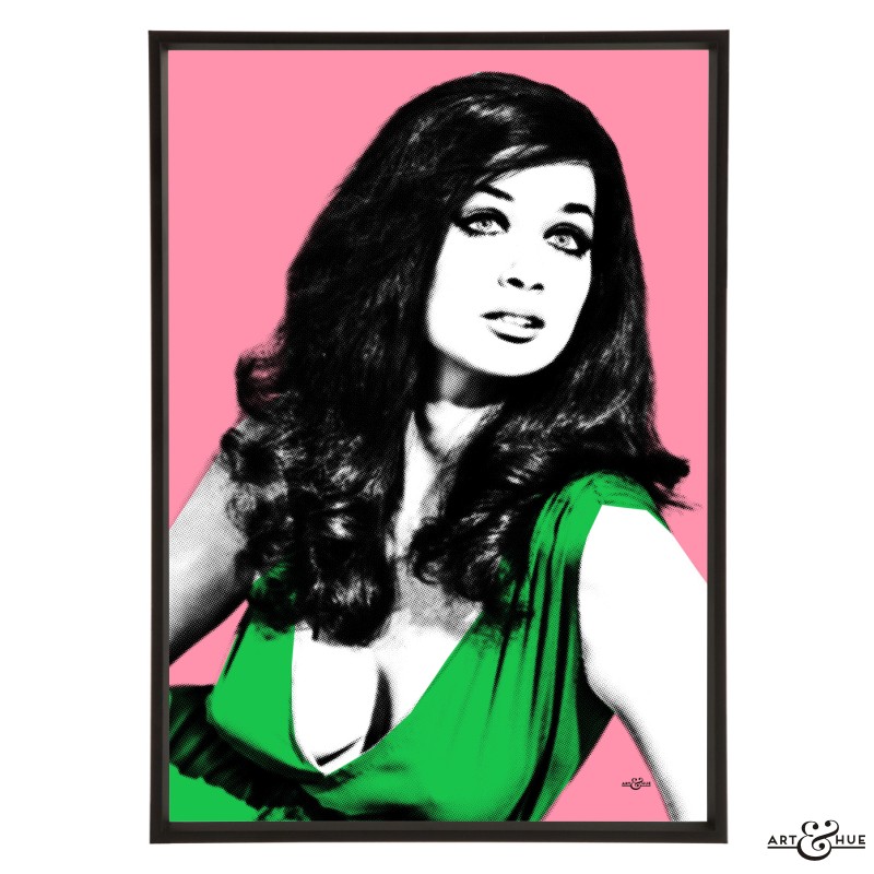
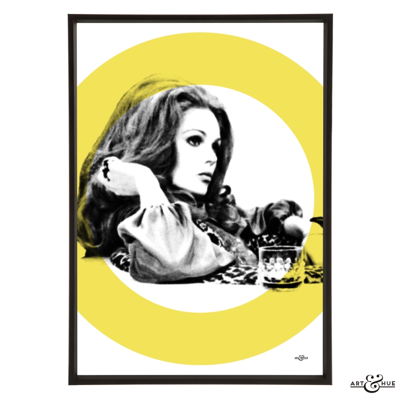
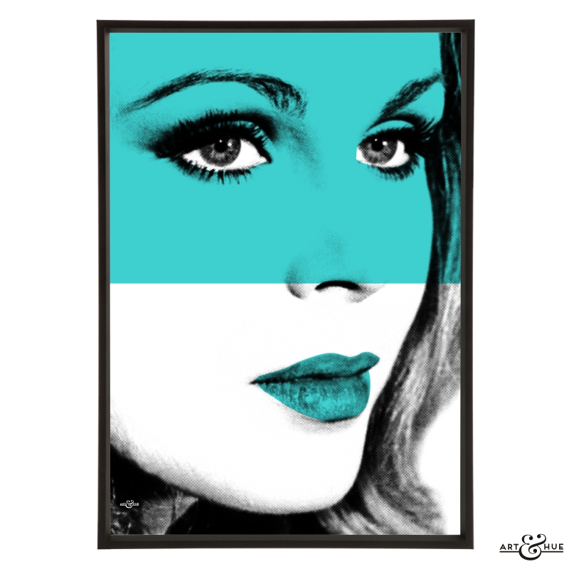
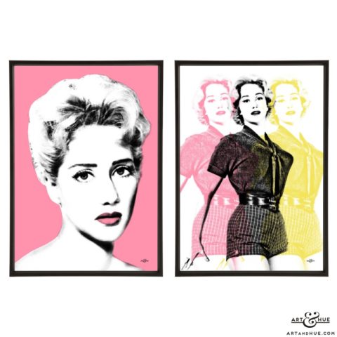
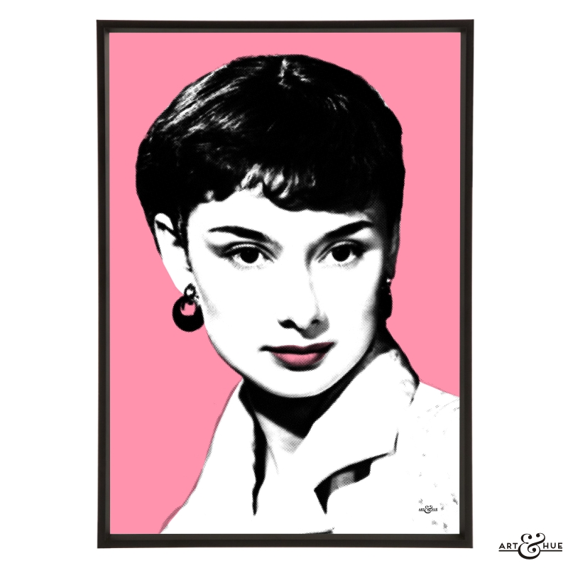
Pop art print pictured is of Yvonne Mitchell from the Leading Ladies collection in Coral.
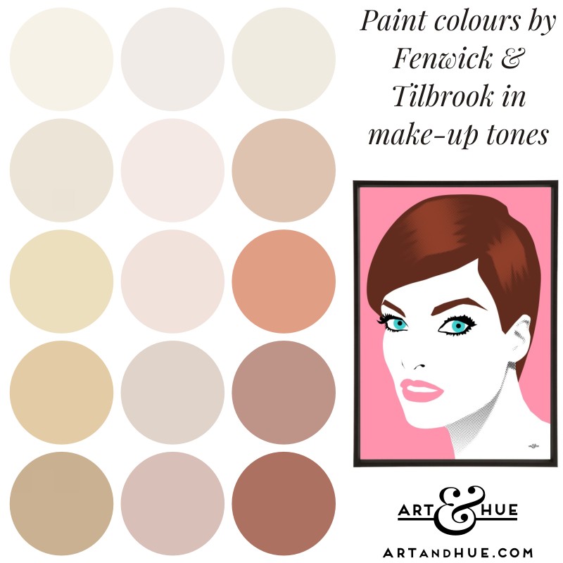
Fenwick & Tilbrook
From golden tans to delicate pinks, they’ve also got a wide range of soft lilacs and purples that can sometimes be ignored by other paint cards.
Their subtle pinks, like Powder, Gypsum & Vintage Peony have a creamy make-up quality to them, as do their options of Trenchcoat, Marrakech, and Sandbanks.
Visit Fenwick & Tilbrook to see the available colours.
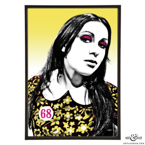
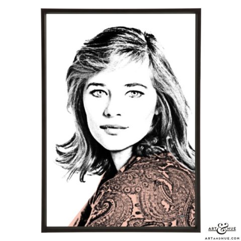
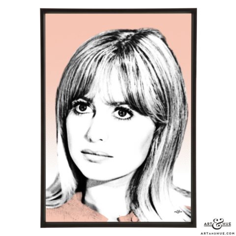
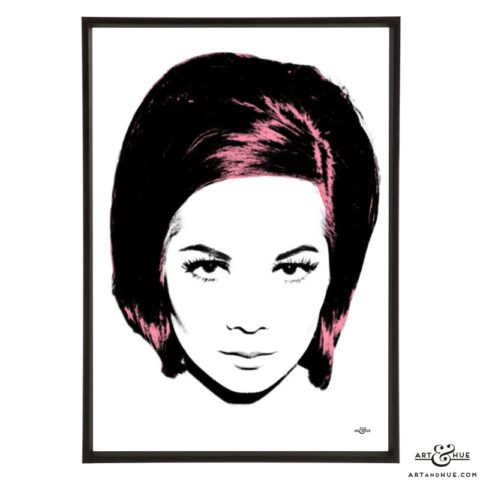
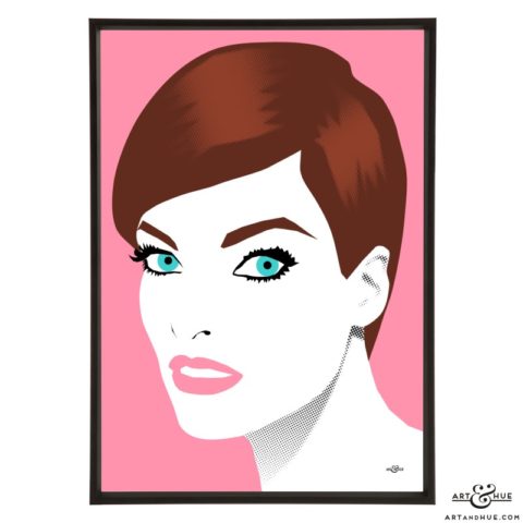
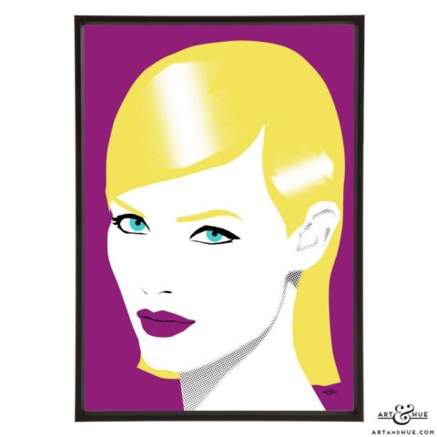
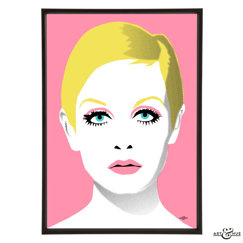
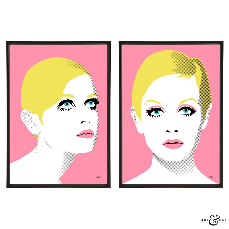
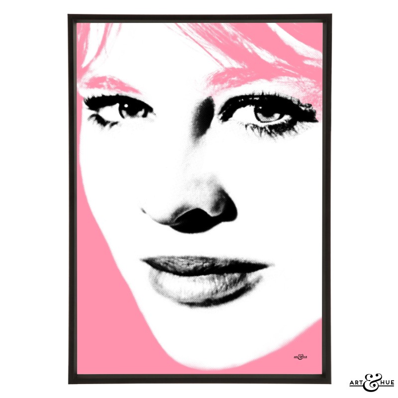
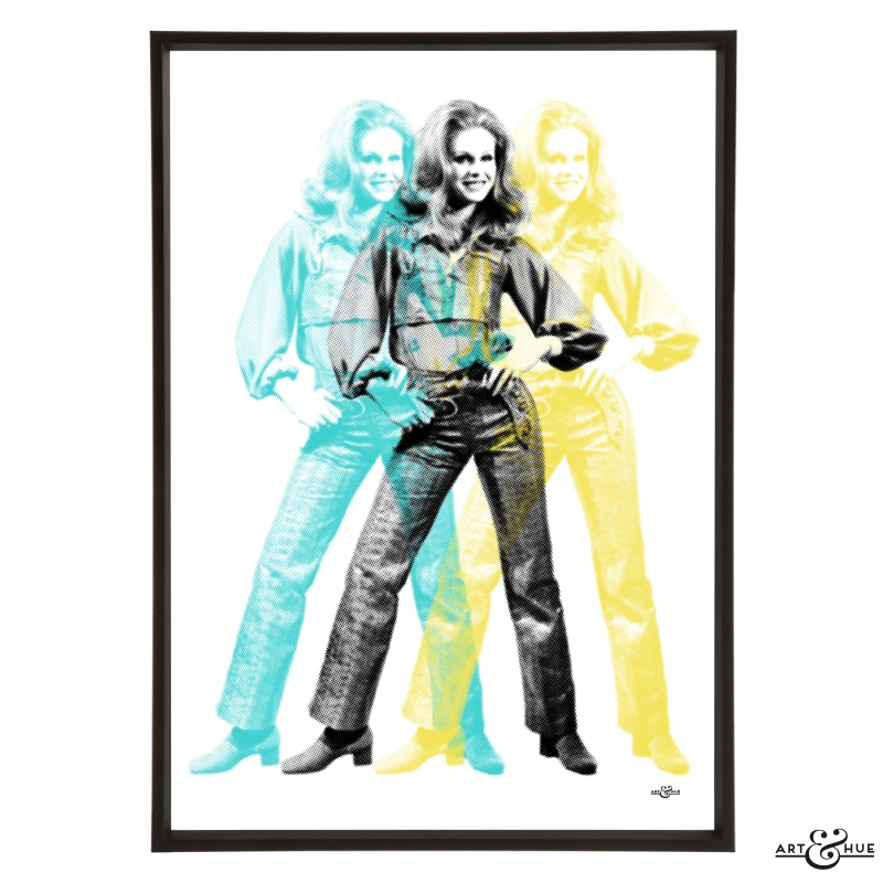
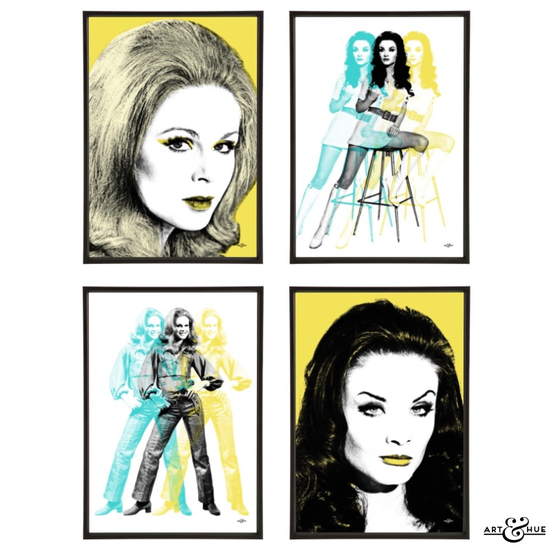
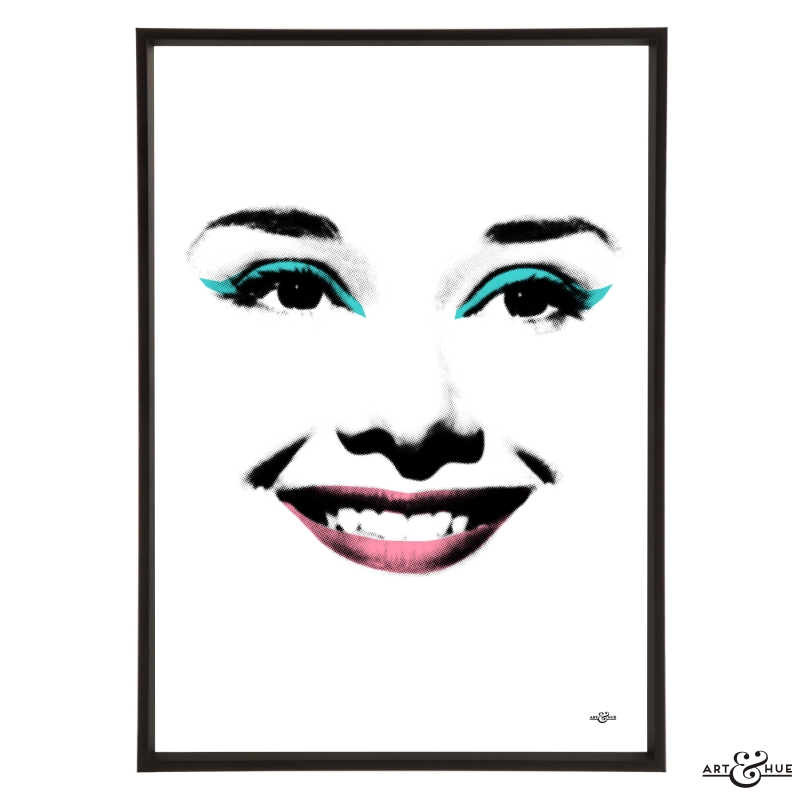
Pop art print pictured is of Linda Evangelista from the Supermodels collection in Think Pink.
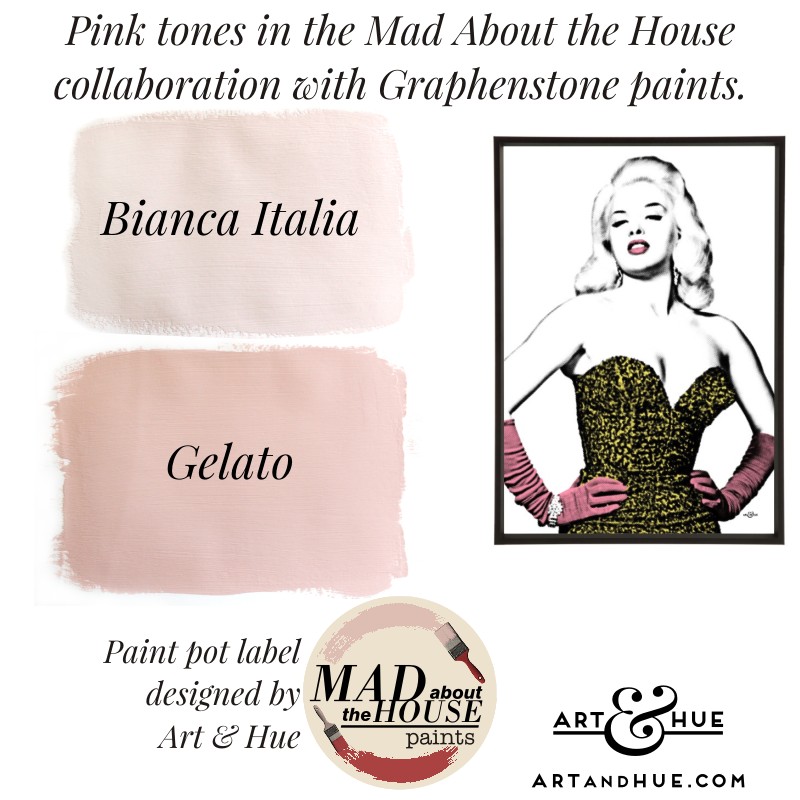
Mad About the House x Graphenstone
Finally, a small mention of the two pinks in the Mad About the House collaboration with Graphenstone.
Not necessarily skin tones, although Bianca Italia could be the palest of English roses raised under a parasol all her life, think of the pinks as blushers or lip tints to bring flushed warmth to a space.
Visit Graphenstone to see the colours in The Italian Collection.
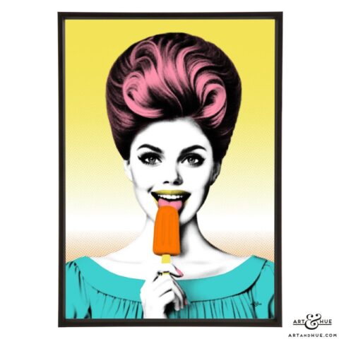
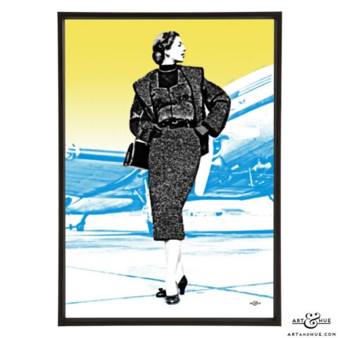
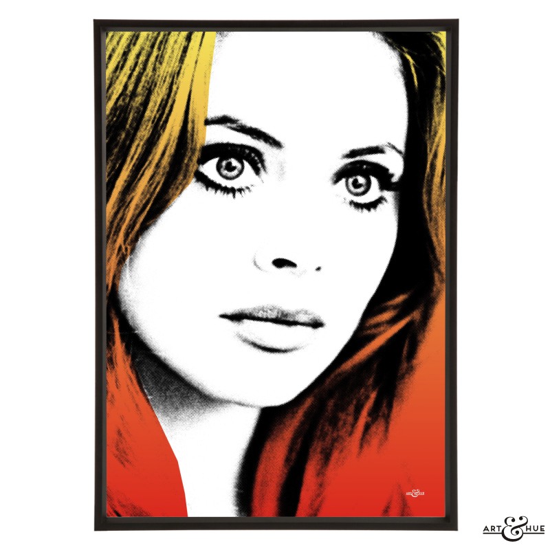
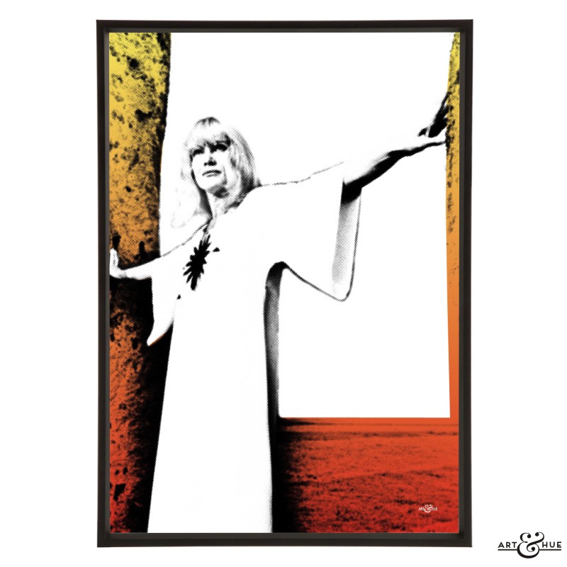
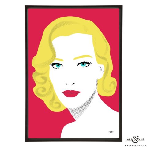
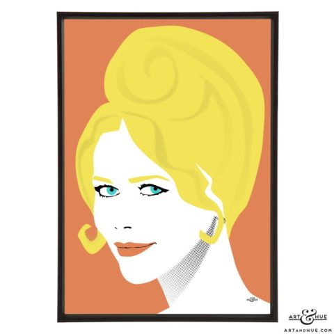
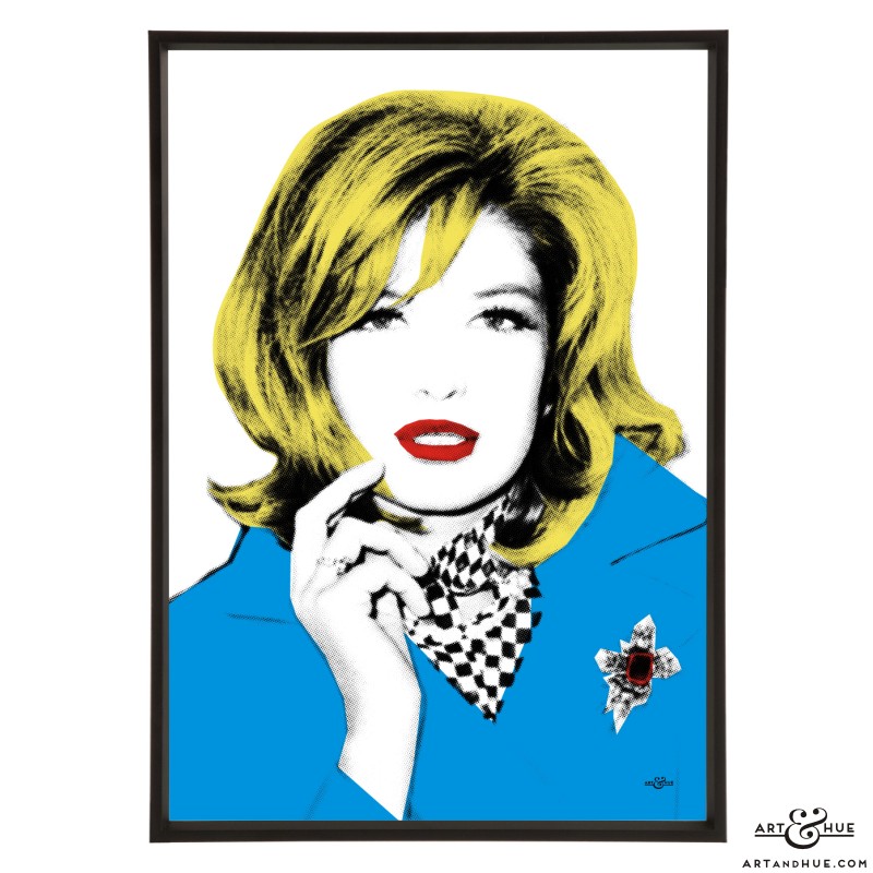
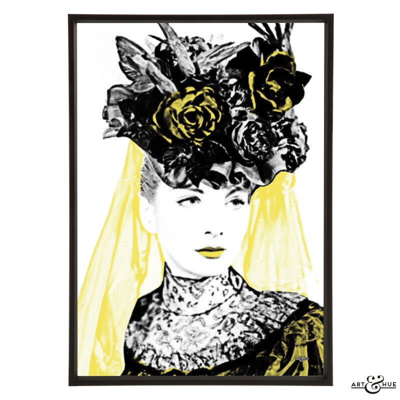
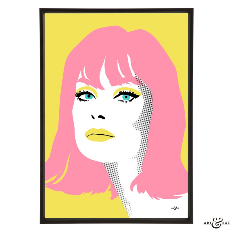
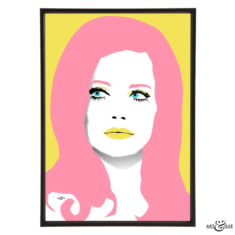
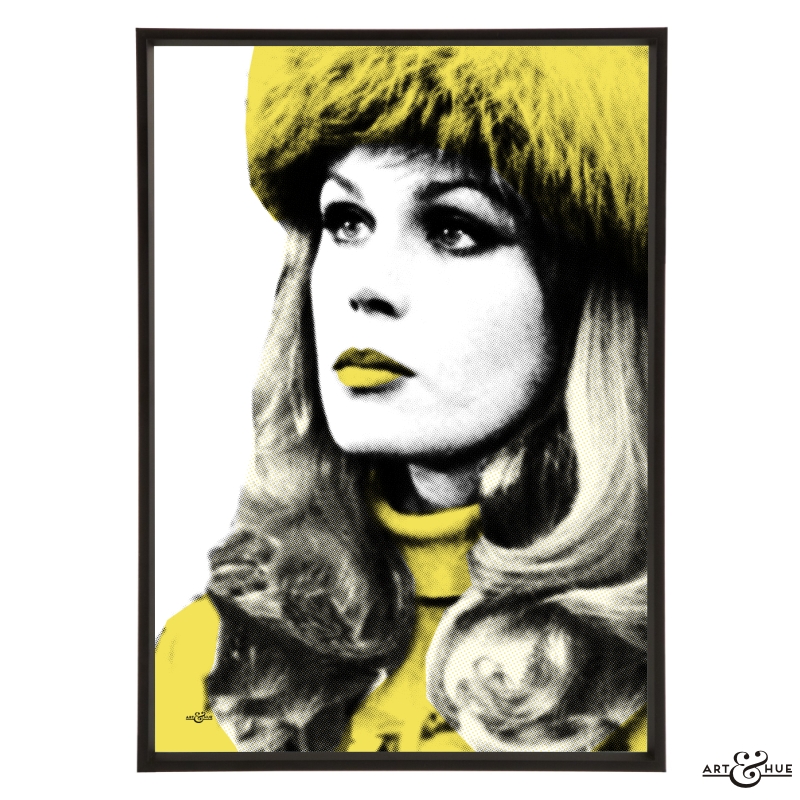
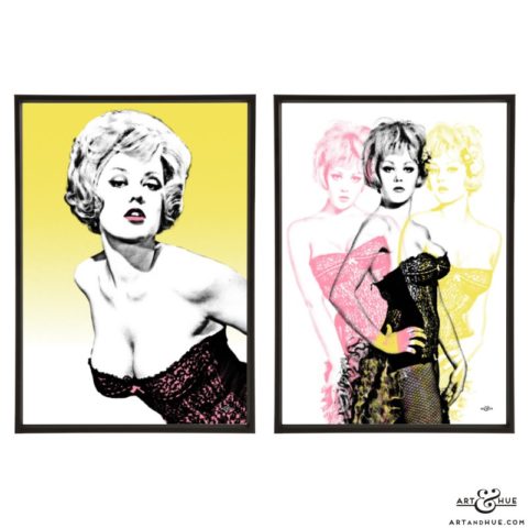
Pop art print pictured is of Blonde Bombshell from the British Blonde Bombshells collection in Think Pink & Yellow.
A side note: Art & Hue designed the paint collection’s branding in collaboration with Mad About the House, using pop art brushes, which are applied to the side of the adorable paint tins.
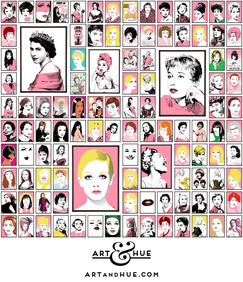
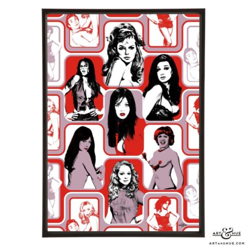
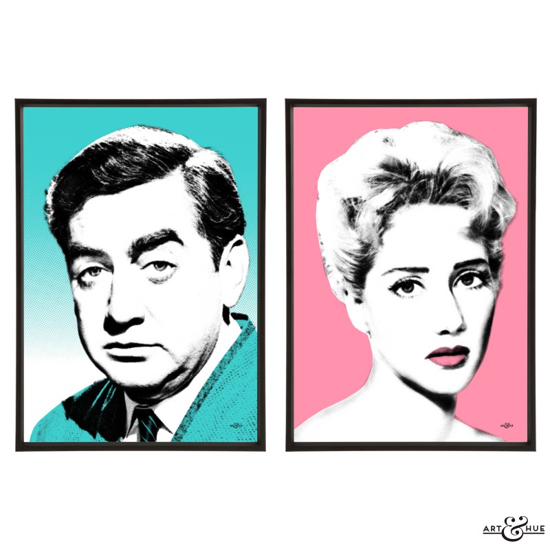
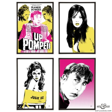
And to bring additional glamour to your walls, take a look at the pop art prints below featuring beauty, fashion, music, film and TV icons:
-

Marilyn Pop Art
£19.00 – £39.00 Select options -
Steed Pair
£28.00 – £76.00 Select options -
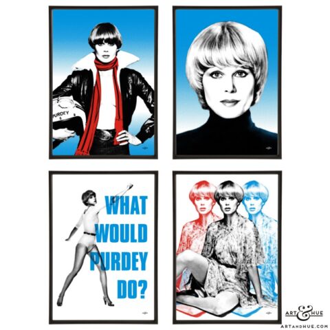
Purdey Group
£55.00 – £155.00 Select options -
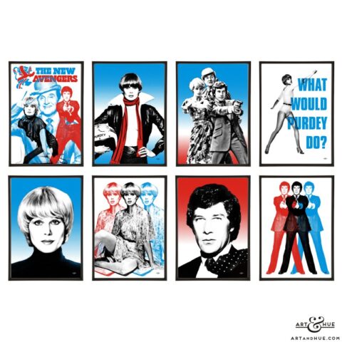
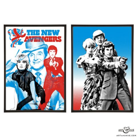
New Avengers Group
£108.00 – £300.00 Select options -
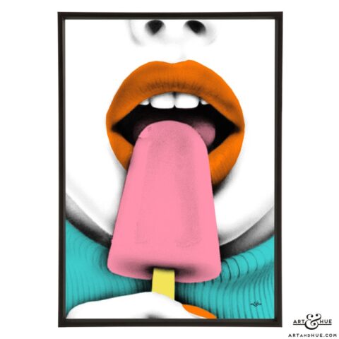
Ice Lolly
£15.00 – £39.00 Select options -
Ice Queen
£15.00 – £39.00 Select options -
Pop-sicle
£15.00 – £39.00 Select options -
Ice Pop
£15.00 – £39.00 Select options -
Lols
£15.00 – £39.00 Select options -
Glamsicle
£15.00 – £39.00 Select options -
Ice Lolly Pair
£28.00 – £76.00 Select options -
Ice Glam Group
£55.00 – £155.00 Select options -
Lolly Pop Group
£82.00 – £226.00 Select options -

School For Scoundrels
£15.00 – £39.00 Select options -

Four Aprils
£15.00 – £39.00 Select options -
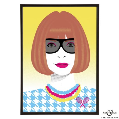
Tennis Club
£15.00 – £39.00 Select options -
School For Scoundrels Group
£108.00 – £300.00 Select options -
Janette Scott Group
£55.00 – £155.00 Select options -
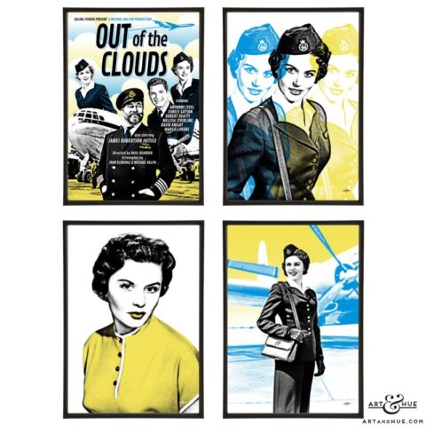
Out of the Clouds Poster
£15.00 – £39.00 Select options -
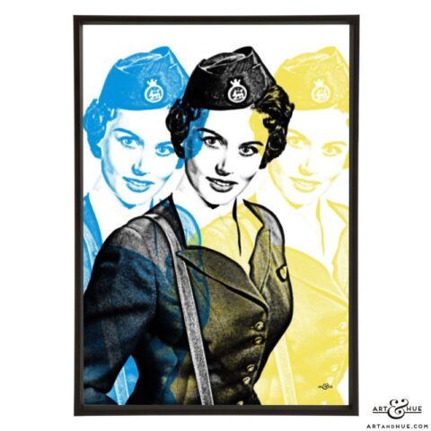
BOAC Stewardess
£15.00 – £39.00 Select options -
BOAC Passenger
£15.00 – £39.00 Select options -
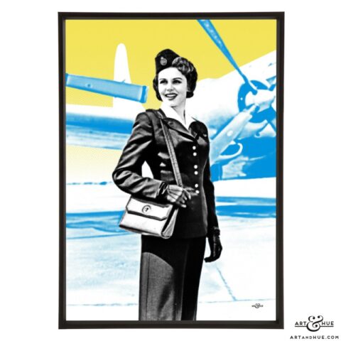
BOAC Airside
£15.00 – £39.00 Select options -
Eunice Gayson OOTC
£15.00 – £39.00 Select options -
Sylvana Henriques
£15.00 – £39.00 Select options -
Trina Parks
£15.00 – £39.00 Select options -

Gloria Hendry
£15.00 – £39.00 Select options -

Grace Jones
£15.00 – £39.00 Select options -
Naomie Harris
£15.00 – £39.00 Select options -
Lashana Lynch
£15.00 – £39.00 Select options -
Black Women of Bond Group
£82.00 – £226.00 Select options -
Anna
£15.00 – £39.00 Select options -
Diana
£15.00 – £39.00 Select options -
Liz
£15.00 – £39.00 Select options -
André
£15.00 – £39.00 Select options -
Patsy
£15.00 – £39.00 Select options -
Miranda
£15.00 – £39.00 Select options -
Wilhelmina
£15.00 – £39.00 Select options -
Maggie
£15.00 – £39.00 Select options -
Fashion Editors Group
£55.00 – £155.00 Select options -
Fictional Fashion Editors Group
£55.00 – £155.00 Select options -
Britt Ekland
£15.00 – £39.00 Select options -
Willow’s Song
£15.00 – £39.00 Select options -
White Witch
£15.00 – £39.00 Select options -

Ingrid Pitt
£15.00 – £39.00 Select options -
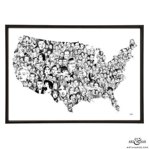
Movie Map of America
£93.00 Select options -
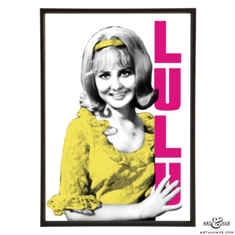
Lulu
£15.00 – £39.00 Select options -
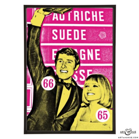
Lys Assia
£15.00 – £39.00 Select options -
France Gall & Udo Jürgens
£15.00 – £39.00 Select options -
Massiel
£15.00 – £39.00 Select options -
Milly Scott
£15.00 – £39.00 Select options -
Belle
£15.00 – £39.00 Select options -
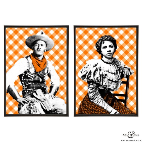
Cowboy Couple
£28.00 – £76.00 Select options -
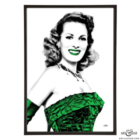
Maureen O’Hara
£15.00 – £39.00 Select options -
Constance Smith
£15.00 – £39.00 Select options -
Sylvia Syms
£15.00 – £39.00 Select options -
Charlotte Rampling
£15.00 – £39.00 Select options -
Margaret Lockwood
£15.00 – £39.00 Select options -
Vanessa Redgrave
£15.00 – £39.00 Select options -
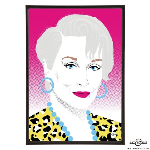
Yvonne Mitchell
£15.00 – £39.00 Select options -
Susan George
£15.00 – £39.00 Select options -
Patricia Roc
£15.00 – £39.00 Select options -
Eunice Gayson
£15.00 – £39.00 Select options -
Dinah Sheridan
£15.00 – £39.00 Select options -
Leslie Caron
£15.00 – £39.00 Select options -
Jean Simmons
£15.00 – £39.00 Select options -
Patricia Dainton
£15.00 – £39.00 Select options -

Elizabeth Sellars
£15.00 – £39.00 Select options -
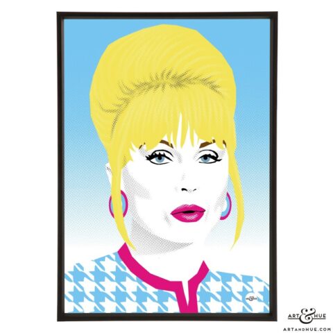
Diana Dors
£15.00 – £39.00 Select options -
Carole Lesley
£15.00 – £39.00 Select options -
Margaret Nolan
£15.00 – £39.00 Select options -
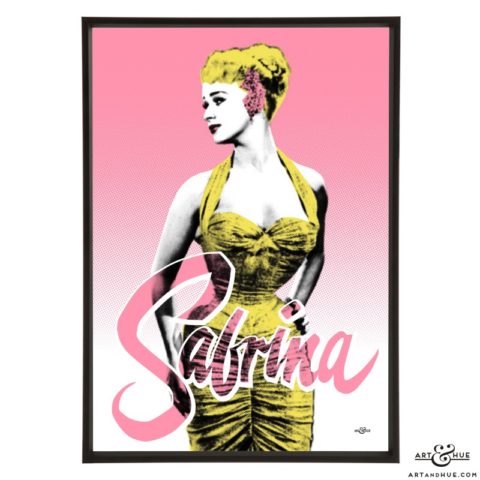
Sabrina
£15.00 – £39.00 Select options -
Triple Nolan
£15.00 – £39.00 Select options -
Diana Dialling
£15.00 – £39.00 Select options -
Triple Liz Fraser
£15.00 – £39.00 Select options -
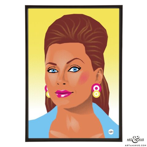
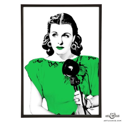
Blonde Bombshell
£15.00 – £39.00 Select options -
Air Eunice Group
£55.00 – £155.00 Select options -
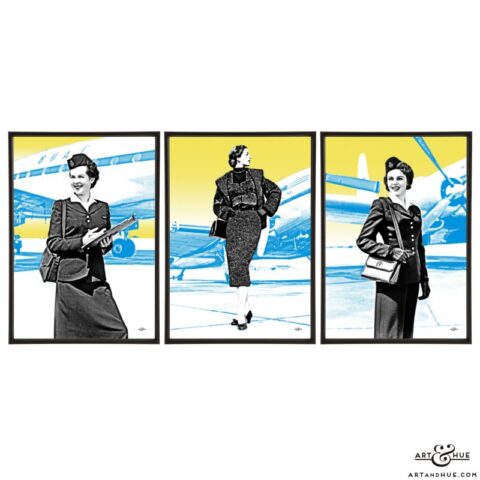
Airside Trio
£42.00 – £114.00 Select options -
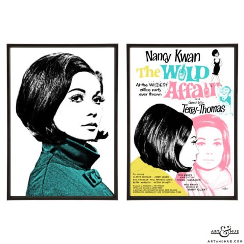
Kwan Quant
£15.00 – £39.00 Select options -
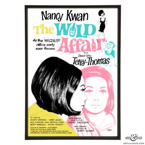
The Wild Affair
£15.00 – £39.00 Select options -
Kwan Quad
£15.00 – £39.00 Select options -
Nancy Nine
£15.00 – £39.00 Select options -
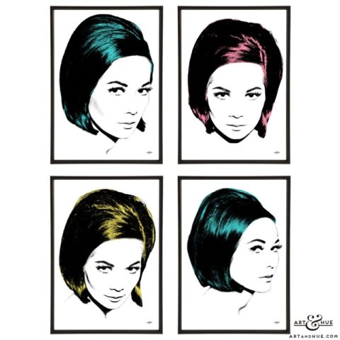
Nancy Kwan
£15.00 – £39.00 Select options -
Nancy
£15.00 – £39.00 Select options -
Kwan Cut
£15.00 – £39.00 Select options -
Nancy Bob
£15.00 – £39.00 Select options -
Wild Affair Pair
£28.00 – £76.00 Select options -
Nancy Pair
£28.00 – £76.00 Select options -
Kwan Group
£55.00 – £151.00 Select options -
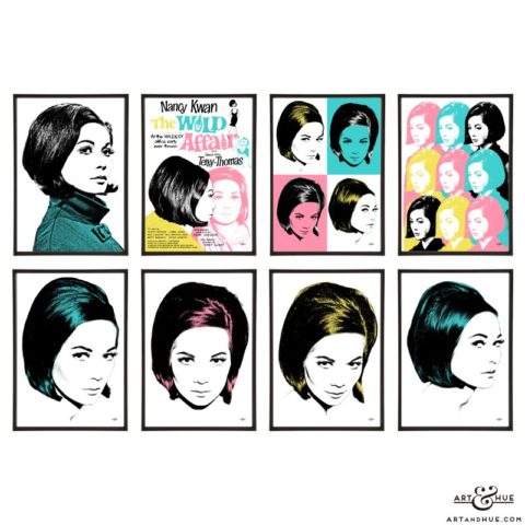
Nancy Kwan Group
£108.00 – £300.00 Select options -
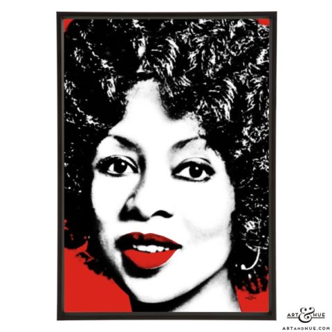
Lola Falana
£15.00 – £39.00 Select options -
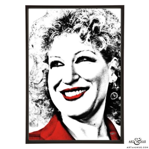
Bette Midler
£15.00 – £39.00 Select options -
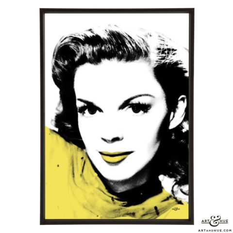
Judy Garland
£15.00 – £39.00 Select options -
Glynis Johns
£15.00 – £39.00 Select options -
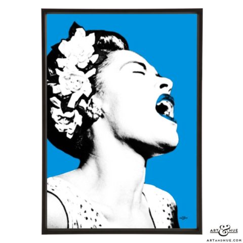
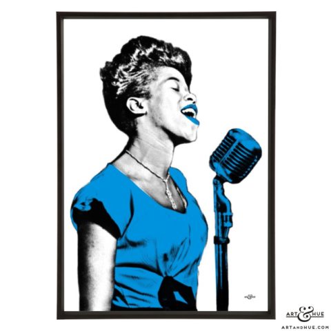
Billie Holiday
£15.00 – £39.00 Select options -
June Christy
£15.00 – £39.00 Select options -
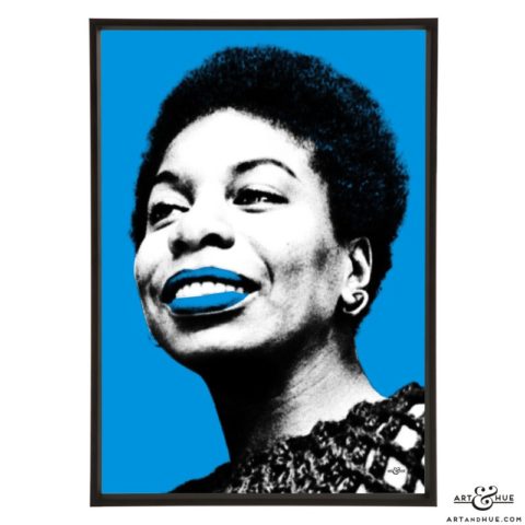
Nina Simone
£15.00 – £39.00 Select options -
Sarah Vaughan
£15.00 – £39.00 Select options -
Cleo Laine
£15.00 – £39.00 Select options -
Abbey Lincoln
£15.00 – £39.00 Select options -
Saucy Wallpaper
£15.00 – £39.00 Select options -
Madeline Smith
£15.00 – £39.00 Select options -
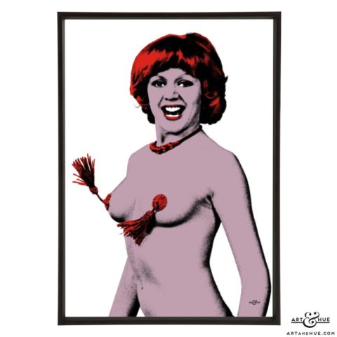
Carol Hawkins
£15.00 – £39.00 Select options -
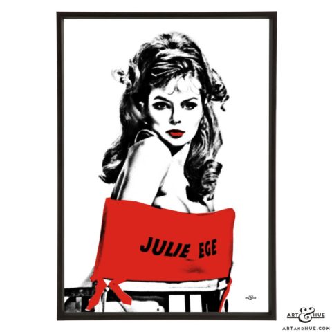
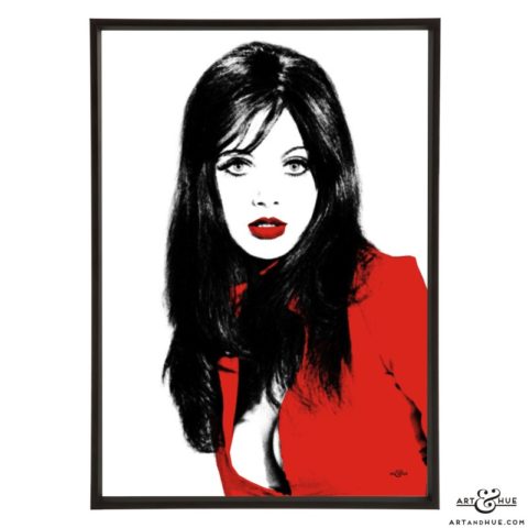
Julie Ege
£15.00 – £39.00 Select options -
Percy’s Progress
£15.00 – £39.00 Select options -
Caroline Munro
£15.00 – £39.00 Select options -
Jenny Hanley
£15.00 – £39.00 Select options -
Antonia Ellis
£15.00 – £39.00 Select options -
Vikki Richards
£15.00 – £39.00 Select options -
Saucy Valerie Leon
£15.00 – £39.00 Select options -
Saucy Seventies Group
£134.00 – £374.00 Select options -
Linda
£15.00 – £39.00 Select options -

Naomi
£15.00 – £39.00 Select options -
Christy
£15.00 – £39.00 Select options -
Kate
£15.00 – £39.00 Select options -
Cindy
£15.00 – £39.00 Select options -
Tatjana
£15.00 – £39.00 Select options -
Claudia
£15.00 – £39.00 Select options -
Amber
£15.00 – £39.00 Select options -
Cover Girls
£15.00 – £39.00 Select options -
Supermodels Group
£108.00 – £300.00 Select options -
Trinity Trio
£42.00 – £114.00 Select options -
Supermodel Five Group
£69.00 – £189.00 Select options -
Monica Vitti
£15.00 – £39.00 Select options -
Martin Landau & Barbara Bain
£15.00 – £39.00 Select options -
Barbara Feldon
£15.00 – £39.00 Select options -
Claudia Cardinale
£15.00 – £39.00 Select options -
Capucine
£15.00 – £39.00 Select options -
Ealing Repertory
£15.00 – £39.00 Select options -
Barbara Murray
£15.00 – £39.00 Select options -
Joan Greenwood
£15.00 – £39.00 Select options -
Valerie Hobson
£15.00 – £39.00 Select options -
Peggy Cummins
£15.00 – £39.00 Select options -
Moira Lister
£15.00 – £39.00 Select options -
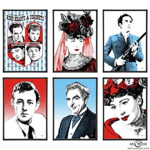
Kind Hearts and Coronets Group
£82.00 – £226.00 Select options -
Jackie Collins
£15.00 – £39.00 Select options -
Pin-Up Jackie
£15.00 – £39.00 Select options -

Jackie Portrait
£15.00 – £39.00 Select options -
Triple Jackie
£15.00 – £39.00 Select options -
Jackie Collins Group
£55.00 – £151.00 Select options -
Liz Fraser
£15.00 – £39.00 Select options -
Yootha Joyce
£15.00 – £39.00 Select options -
Funny Women Group
£134.00 – £374.00 Select options -
Tony Hancock & Liz Fraser Pair
£28.00 – £76.00 Select options -
Up Pompeii Group
£55.00 – £151.00 Select options -
Yootha Pair
£28.00 – £76.00 Select options -
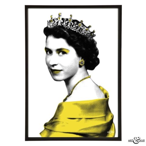
The Queen
£15.00 – £39.00 Select options -
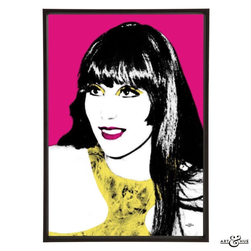
Cherilyn
£15.00 – £39.00 Select options -
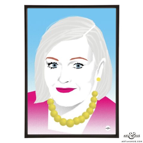
Dame Shirl
£15.00 – £39.00 Select options -
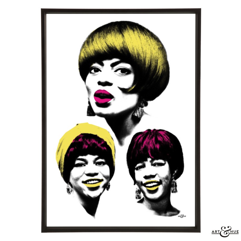
The Supremes
£15.00 – £39.00 Select options -
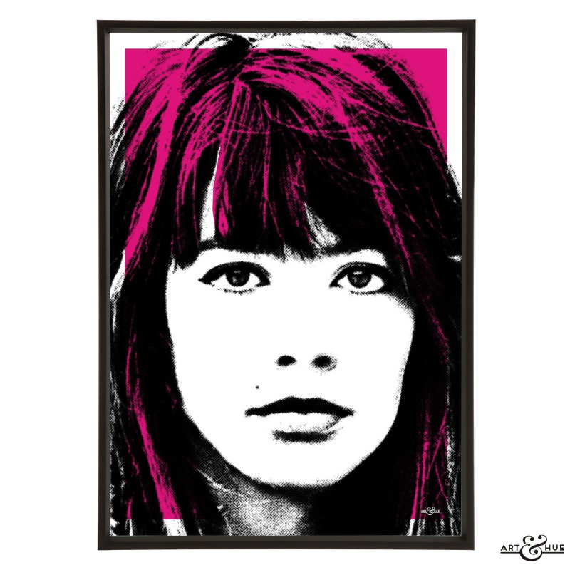
Françoise Hardy
£15.00 – £39.00 Select options -
UK Winners Trio
£42.00 – £114.00 Select options -
UK Runners Up Group
£55.00 – £151.00 Select options -
European Group
£55.00 – £151.00 Select options -
Netherlands Pair
£28.00 – £76.00 Select options -
Let’s Be Happy
£15.00 – £39.00 Select options -

Twigs
£15.00 – £39.00 Select options -
Twiggy
£15.00 – £39.00 Select options -
Jean Shrimpton
£15.00 – £39.00 Select options -
Donyale Luna
£15.00 – £39.00 Select options -
Veruschka
£15.00 – £39.00 Select options -

Peggy Moffitt
£15.00 – £39.00 Select options -
Twiggy Pair
£28.00 – £76.00 Select options -
Yield to the Night
£15.00 – £39.00 Select options -
Julie It Girl
£15.00 – £39.00 Select options -
Julie Boat
£15.00 – £39.00 Select options -
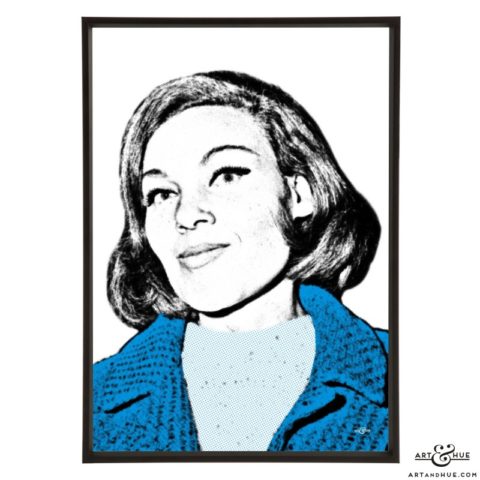
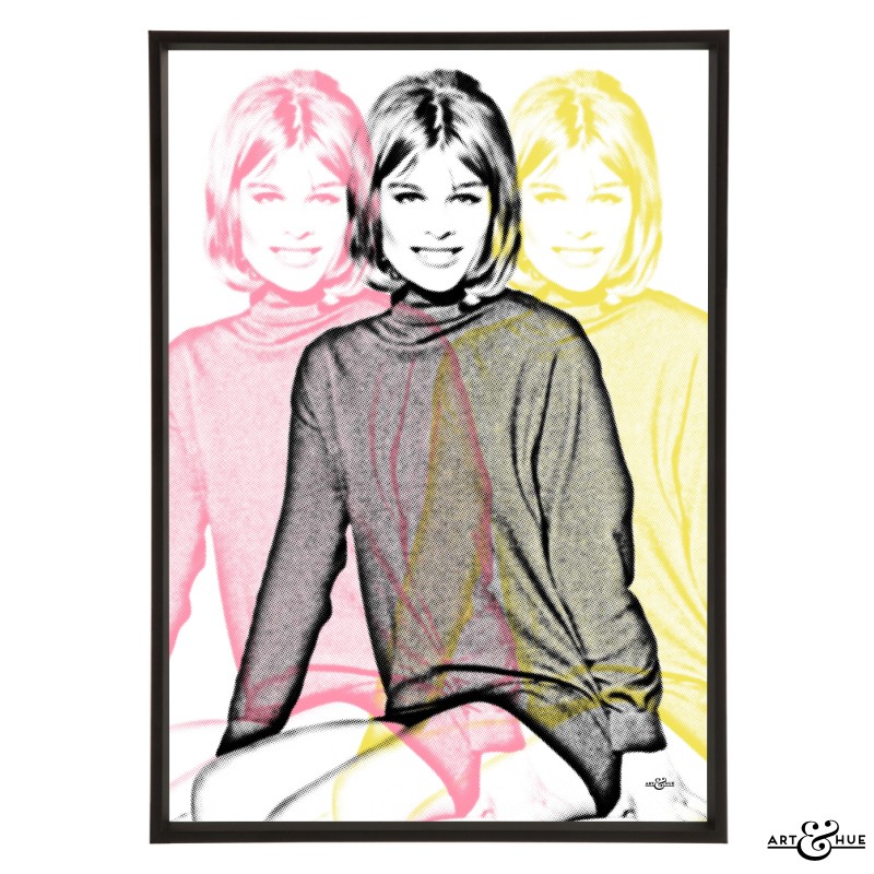
Julie Christie
£15.00 – £39.00 Select options -
Julie Face
£15.00 – £39.00 Select options -
Triple Julie
£15.00 – £39.00 Select options -
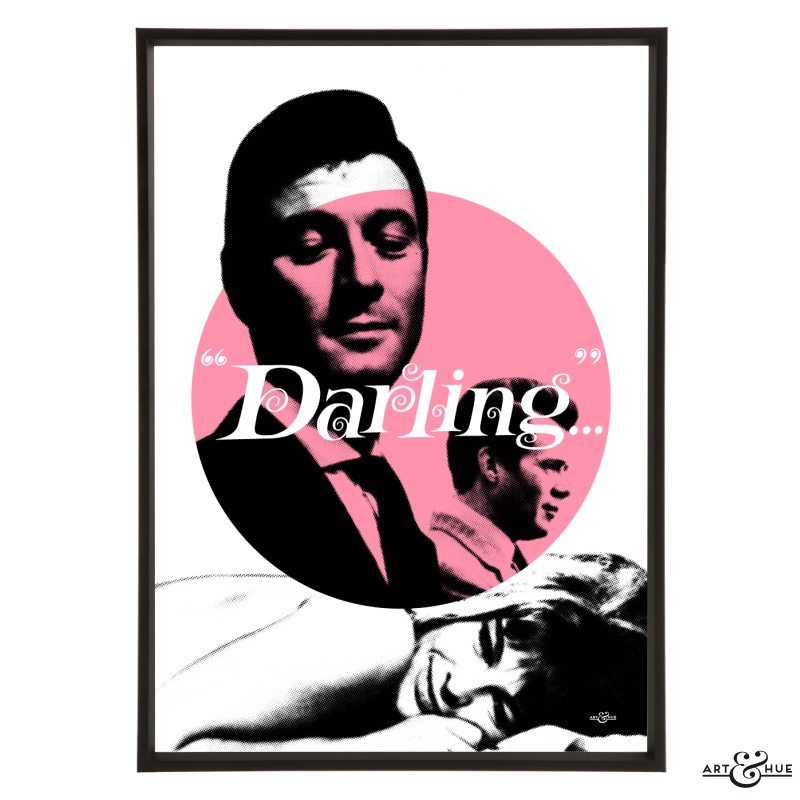
Julie Darling
£15.00 – £39.00 Select options -
Julie Christie Group
£82.00 – £226.00 Select options -
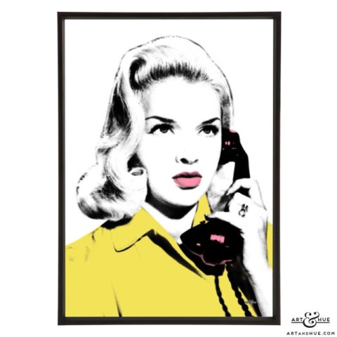
Phone Joan
£15.00 – £39.00 Select options -
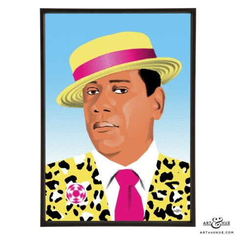
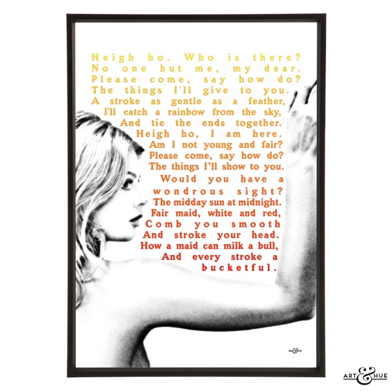
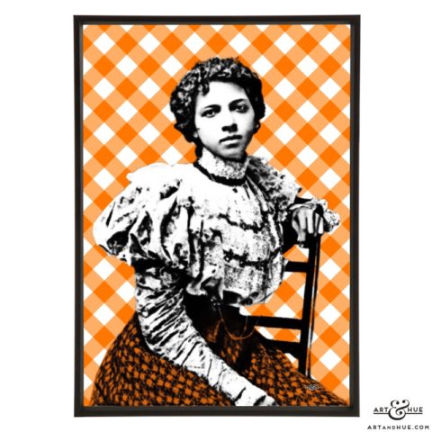
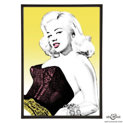
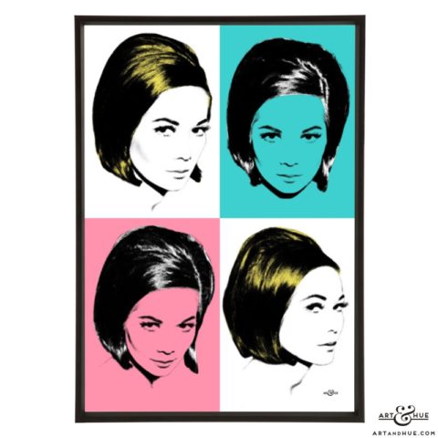
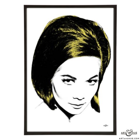
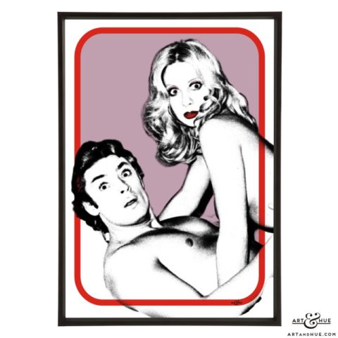
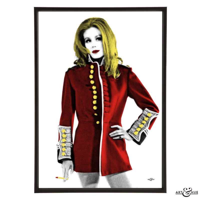
Joan Calling
£15.00 – £39.00 Select options -
Joan Collins
£15.00 – £39.00 Select options -

Triple Joan
£15.00 – £39.00 Select options -
Joan Collins Group
£55.00 – £151.00 Select options -
The Morell Sisters Group
£55.00 – £151.00 Select options -
Collins Sisters Group
£55.00 – £151.00 Select options -
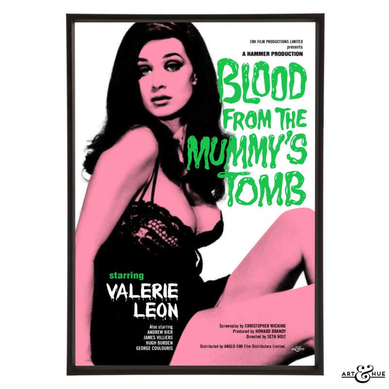
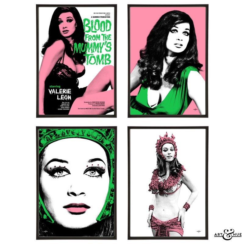
Blood from the Mummy’s Tomb
£15.00 – £39.00 Select options -
Queen Tera
£15.00 – £39.00 Select options -
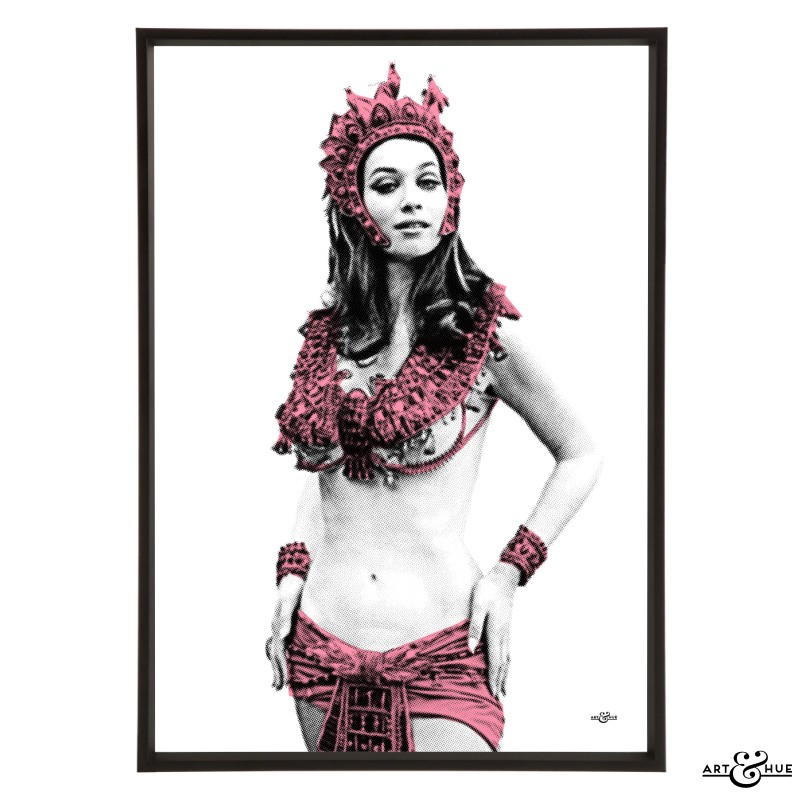
Valerie Leon
£15.00 – £39.00 Select options -
Egyptian Queen
£15.00 – £39.00 Select options -
Triple O’Mara
£15.00 – £39.00 Select options -

Kate O’Mara
£15.00 – £39.00 Select options -
Anouska Hempel
£15.00 – £39.00 Select options -
Blood from the Mummy’s Tomb Group
£55.00 – £151.00 Select options -

Joanna Lumley
£15.00 – £39.00 Select options -
Kiss My Buttons
£15.00 – £39.00 Select options -
Piz Gloria
£15.00 – £39.00 Select options -
Triple Lumley
£15.00 – £39.00 Select options -
Purdey
£15.00 – £39.00 Select options -
Sapphire
£15.00 – £39.00 Select options -
Joanna Lumley Group
£82.00 – £226.00 Select options -
The Stone Sisters Group
£55.00 – £151.00 Select options -
Carry On Cleo
£15.00 – £39.00 Select options -

Carry On Screaming
£15.00 – £39.00 Select options -
Diana Dors Group
£55.00 – £151.00 Select options -
Margaret Nolan Pair
£28.00 – £76.00 Select options -
Liz Fraser Pair
£28.00 – £76.00 Select options -
Bombshells Group
£160.00 – £448.00 Select options -
Audrey Love
£15.00 – £39.00 Select options -
Audrey Beauty
£15.00 – £39.00 Select options -
Audrey Style
£15.00 – £39.00 Select options -

Audrey Modern
£15.00 – £39.00 Select options -
Audrey Laughter
£15.00 – £39.00 Select options -
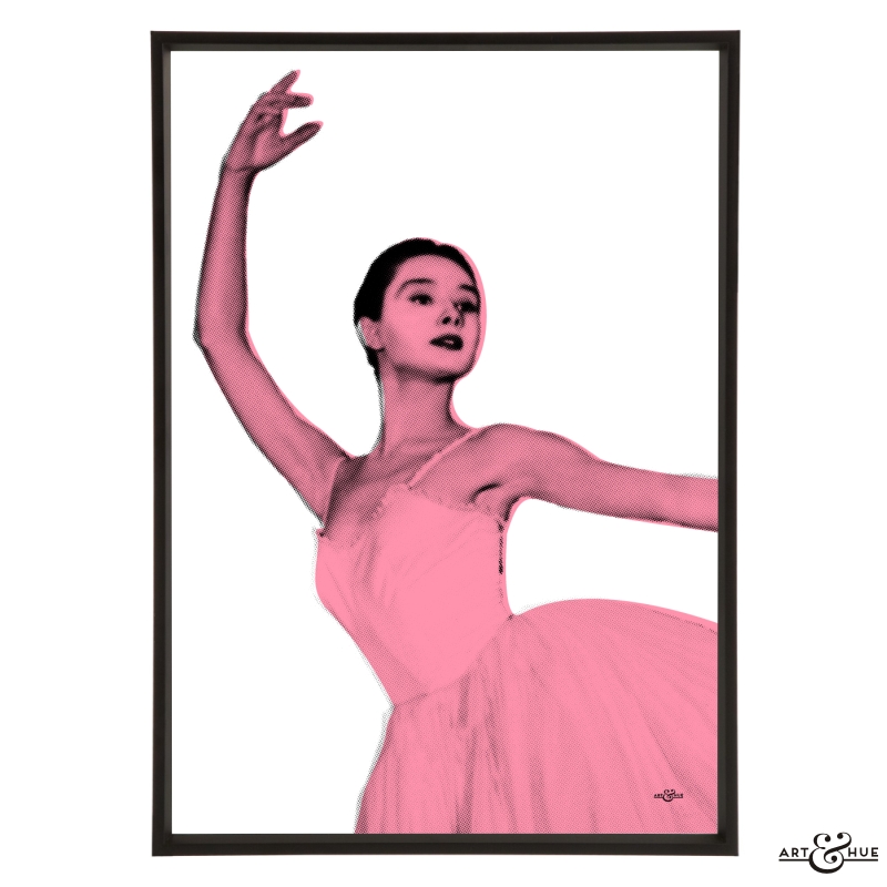
Audrey Ballet
£15.00 – £39.00 Select options -
Audrey Group
£82.00 – £226.00 Select options -

Princess Diana
£15.00 – £39.00 Select options -
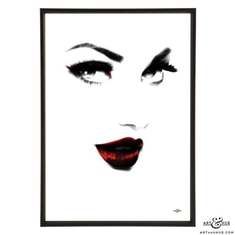
Glamour
£15.00 – £39.00 Select options -

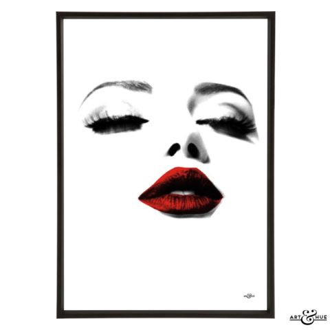
Eye
£15.00 – £39.00 Select options -
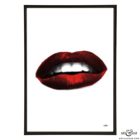
Lips
£15.00 – £39.00 Select options -
Beauty
£15.00 – £39.00 Select options -
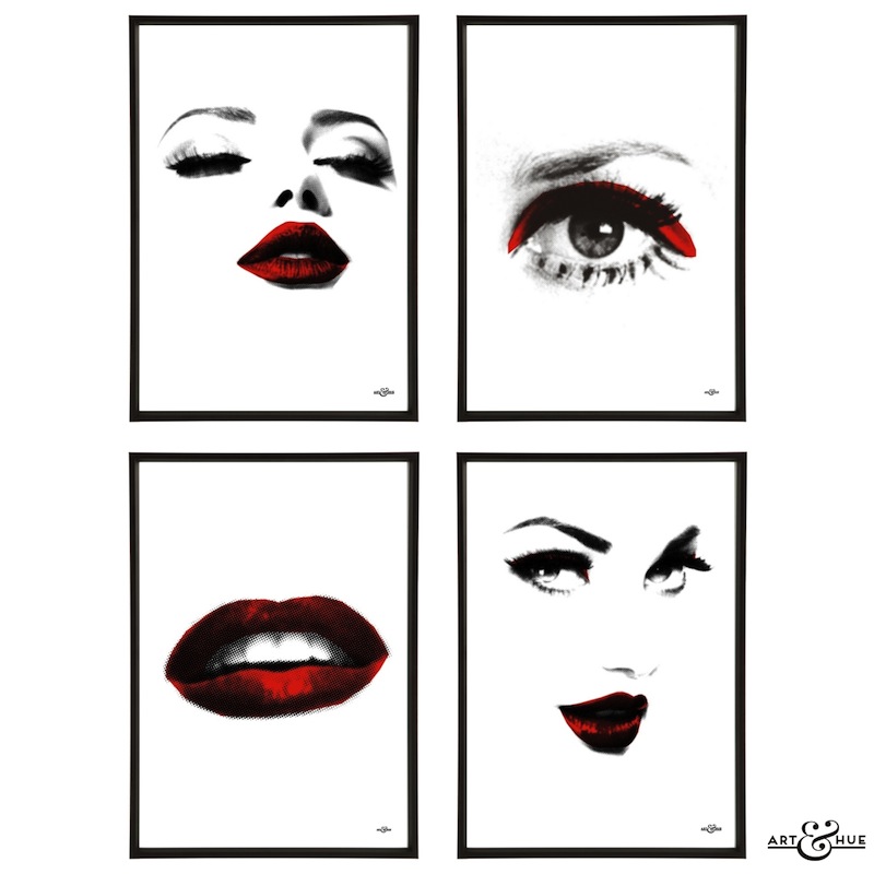
Glamour Group
£55.00 – £151.00 Select options