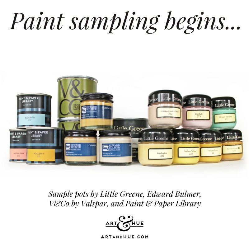
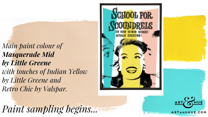
Paint sampling begins…
If decorating was to start tomorrow, it would be bright whites and neon yellows to counteract the dull weather we’ve been having, with low-lying mist and icy fogs that seem to go on longer than is decent for a “snap”. Spring is teasingly round the corner, and then Summer, so will bide time to see how the light moves around the house when we (hopefully) get longer, brighter days of high sun.
In the meantime, rather than drumming fingers on the desk waiting for some rays, paints can still be sampled to see how they cope with the currently dark Winter days and later with Spring brightness.
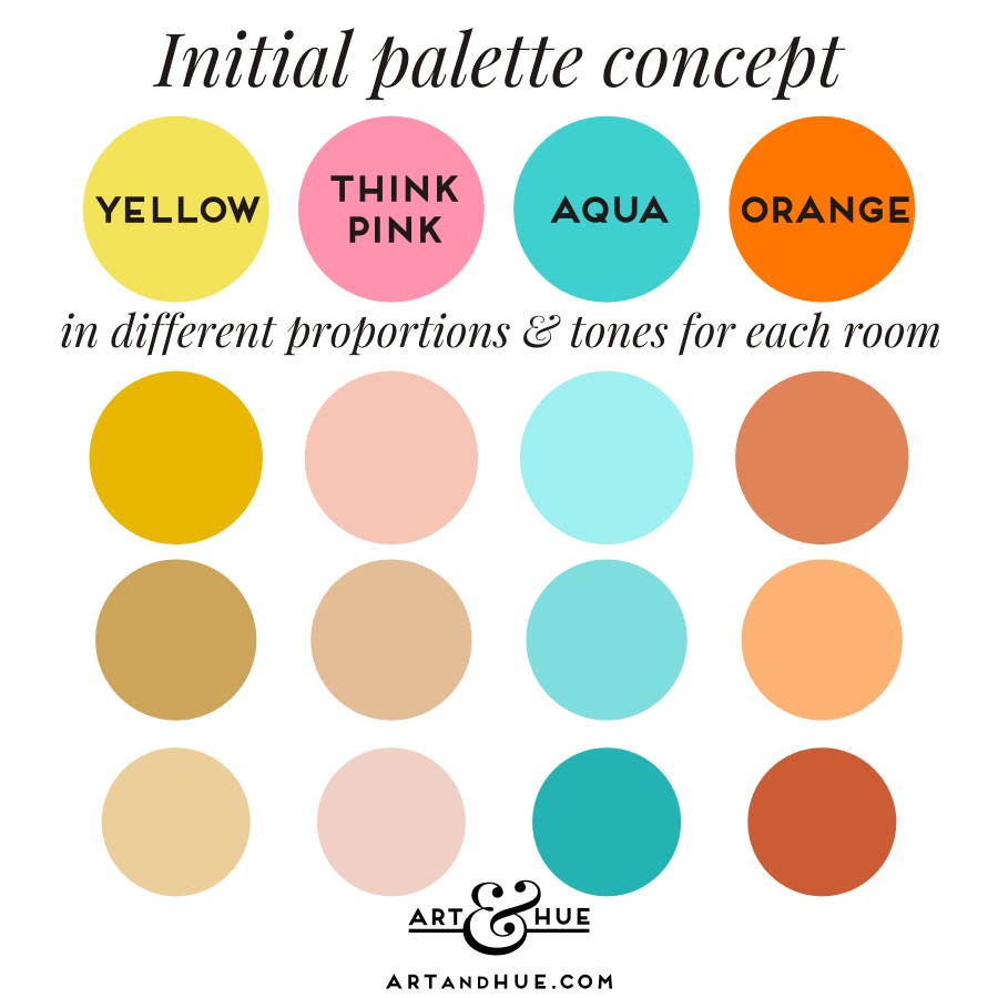
Initial palette concept
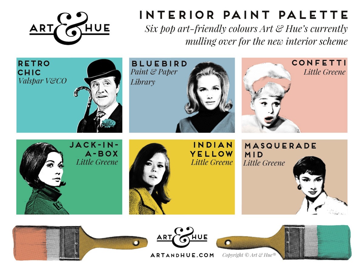
Mulling over paint colours against which art prints can pop. Paint colours pictured: Retro Chic (Valspar), Bluebird (Paint & Paper Library), Confetti, Jack-in-a-Box, Indian Yellow & Masquerade Mid (all Little Greene).
Pop art pictured: John Steed, Cathy Gale, We’re Needed, Barbara Windsor, Kwan Quant, Mrs Peel, We’re Needed, Audrey Style.
To that end, paint samples have been slapped onto white A4 sheets of card to move around rooms and see how they react to the (low Winter) light moving around the house.
Most paint samples are gorgeous colours so the tricky bit will be deciding on which one where. The scheme of aquas, pinks and yellows was in mind ahead of moving in but the house deserves to have its say, and at the moment it’s saying “wait”.
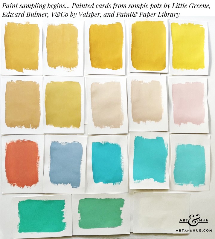
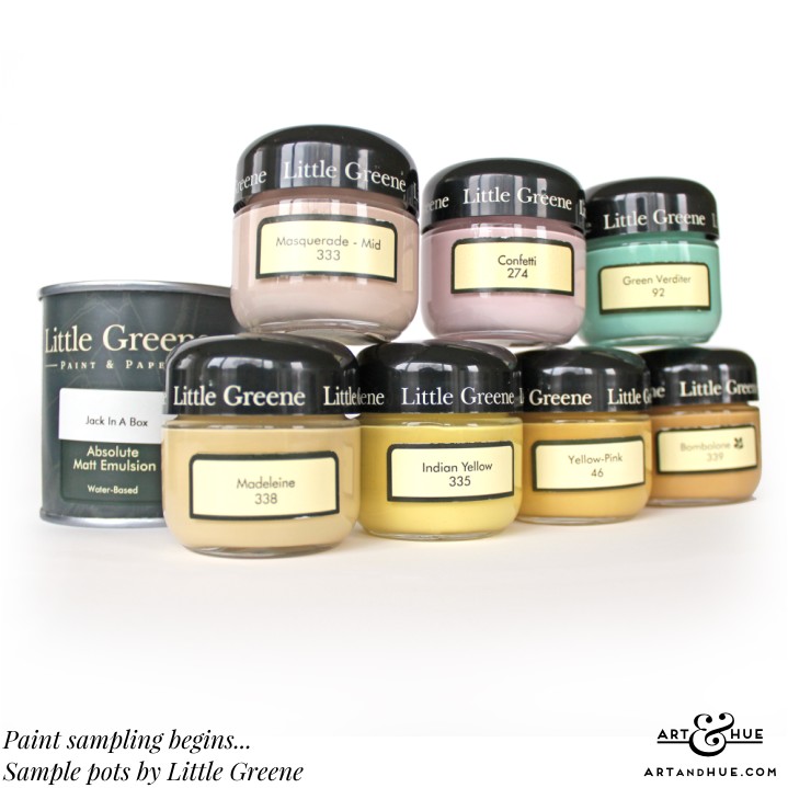
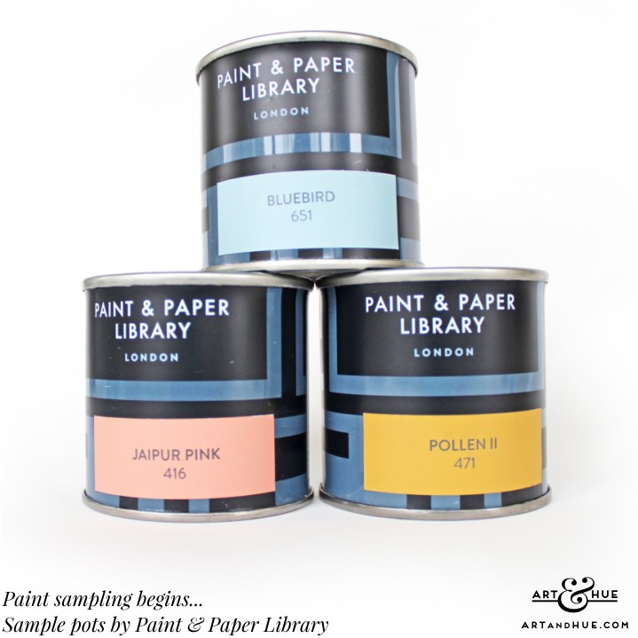
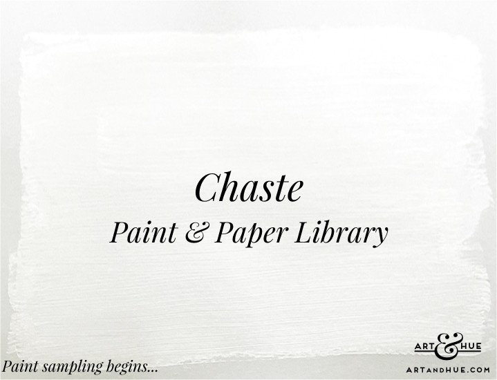
Left to right: Top Row:Bombolone (Little Greene), Trumpington (Edward Bulmer), Pollen II (Paint & Paper Library), Yellow-Pink (LG), Indian Yellow (LG); Second Row: Cinnamon (EB), Madeleine (LG), Jonquil 60% (EB), Masquerade Mid (LG), Confetti (LG): Third Row: Jaipur Pink (P&PL), Bluebird (P&PL), Caribbean Escape (V&CO by Valspar), Retro Chic (V&CO), High Hopes (V&CO): Bottom Row: Jack-in-a-Box (LG), Green Verditer (LG), Chaste (P&PL).
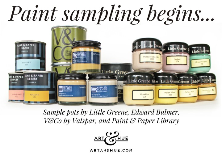
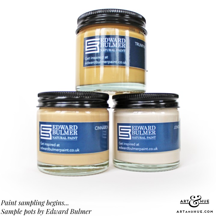
Colours like Edward Bulmer’s Trumpington (a desirable soft ochre) and Cinnamon (a wonderful shade that comes in different strengths, from cardboard box to delicate latte foam) and Little Greene’s Bombolone and Yellow-Pink look beautiful in the colour charts but might not play ball with the natural light in most rooms here, so the colour concept may need rethinking come Spring. (Bulmer’s Jonquil looks highly flexible, a shade that could go anywhere to add subtle warmth, and comes in various tints of 60%, 40% and 20% to complement the main 100% colour).
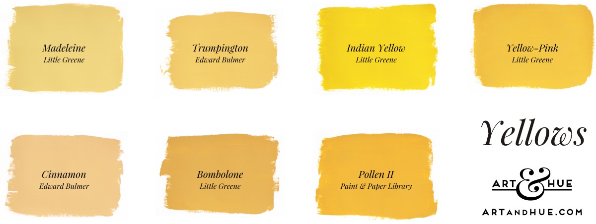
Paints by Little Greene (LG), Edward Bulmer (EB), and Paint & Paper Library (P&PL): Madeleine (LG), Trumpington (EB), Indian Yellow (LG), Yellow-Pink (LG), Cinnamon (EB), Bombolone (LG), Pollen II (P&PL)
One initial thought was to try to pair the original tiled window sills to a paint colour (Pollen II by Paint & Paper Library is the closest match incidentally) but now the thinking is the unique sills would disappear if matched so perhaps they’ll be allowed to contrast and stand out instead.
Of course, the thinking could all change come Spring when the sun has finally got his blooming hat on and the ochres suddenly feel just right. Time will tell so patience (supposedly a virtue) is required.
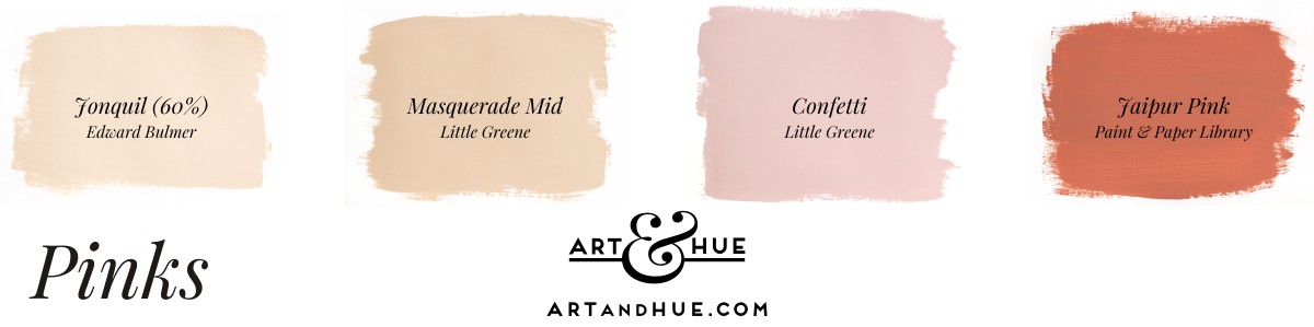
Paints by Little Greene (LG), Edward Bulmer (EB), and Paint & Paper Library (P&PL): Jonquil 60% (EB), Masquerade Mid (LG), Confetti (LG), Jaipur Pink (P&PL)
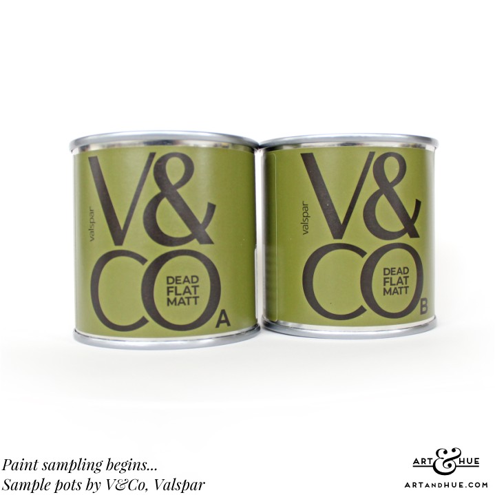
Incidentally, having practically keeled over at the smell of “regular” paints in the past, Valspar’s V&CO formulation was a pleasant surprise – very low VOC content (below 1g/L, much like other natural paint brands) so no unpleasant odour.
A quick note on paint texture: of all the sample pots, paints by Little Greene and Paint & Paper Library are super-thick in particular which bodes well for the final decorating. Having experienced some paints in the past that drip and have frothy air bubbles (that seem to leave an “aero” texture), can imagine they have great coverage and perhaps some colours could even get away with one coat rather than two (although two coats are always advised and some colours may need more depending on the existing base wall).
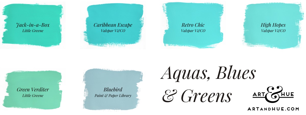
Paints by Little Greene (LG) and Valspar V&CO (V): Jack-in-a-Box (LG), Caribbean Escape (V), Retro Chic (V), High Hopes (V), Green Verditer (LG), Bluebird (P&PL)
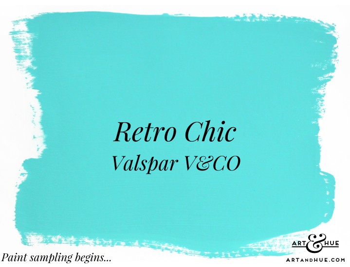
There are three of Valspar’s aqua tones that have been sampled: the darker Caribbean Escape (a very close match to Art & Hue’s Aqua colour option), the paler High Hopes, and the mid-toned Retro Chic. Apart from the appeal of the name (Art & Hue obviously loves all things retro and chic, like Mrs Peel in The Avengers), it’s perfectly balanced in the middle of the other two so it’s richly pigmented without being overpowering, creamy and minty, like blousy 60s & 70s eyeshadow or vintage kitchen appliances.
Aquas are surely due a revival having been missing from interior schemes (and paint colour charts) for what seems like too long. Minty blues (as opposed to bluey greens) don’t have to be relegated to bathrooms or kitchens, they can enliven main rooms and hallways with their joyful freshness.
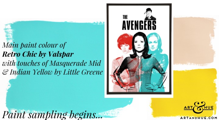
Paints: Retro Chic by Valspar V&CO, Masquerade Mid by Little Greene, and Indian Yellow also by Little Greene.
Pop art print of The Avengers.
As well as new paint collections, every year many companies come out with their “colour of the year” to inspire shoppers to revamp their interiors but these can generally be ignored unless they already confirm colours you currently like. If you’re a fan of bright yellow, then Dulux have confirmed your preference with their sunny yellow called True Joy, or if you’re nuts about brown, then Pantone’s Mocha Mousse will be right up your street.
Having said to wait, there are a couple of paints sampled so far that are definitely going on the walls, ceilings or woodwork somewhere.
I won’t pretend to know what goes into the paint formulation but I’m assuming there’s a fair bit of titanium dioxide in the secret sauce, a natural mineral that provides brightness. It’s widely and safely used in food and cosmetics and is the ingredient in face powders and mineral SPF creams that casts a white pallor on the skin.
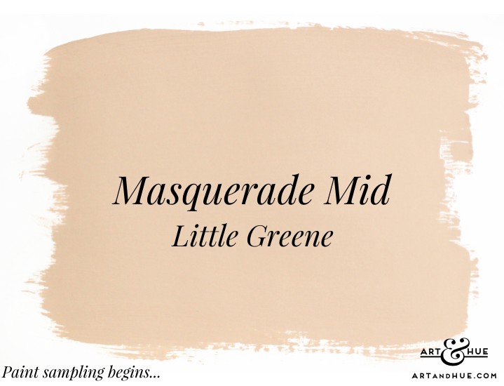
A slightly dusty pink tone with enough yellow and a touch of grey to make it universal, it hits somewhere in the plaster-pink family (let’s not call it peach) and has the look of sun-kissed skin. It works with all shades of pink, including the Blush and Think Pink colour options of Art & Hue prints. It’s adaptable enough to play nicely with all colours – blues, aquas, greens, yellows, oranges, everything – so the tricky decision will be where not to put it.
Of course, a quick side note, all Art & Hue prints are available in a wide choice of 20 key colours that can fit into any interior decor, whether co-ordinating with similar colours for a complimentary look or standing out with a contrasting shade to add visual interest to a space, so don’t feel handcuffed with colour choices – a pop of orange, fuchsia, cyan, aqua or emerald in a soft-toned scheme can spice up a room, and some colours like yellow, blush and leaf are practically neutrals as they fit in anywhere.
Like the colour of freshly skimmed walls, Masquerade Mid is a relaxing shade which could be used in any room. The colour comes in different strengths (a deeper Masquerade and a paler Masquerade Light) so they can be combined to provide tonal interest to woodwork and ceilings. It’s seemingly the Martini of paint colours – anytime, any place, anywhere – and will be definitely going up somewhere.
Paints: Masquerade Mid by Little Greene, Indian Yellow also by Little Greene, and Retro Chic by Valspar V&CO.
Pop art print of School for Scoundrels.
There’s a while to go before the paint brushes are picked up but that doesn’t mean pop art prints can’t be mulled over with each paint colour. The concept is to have touches of aqua, pink and yellow in each room as a unifying thread throughout the house but with the occasional surprise colour such as red, cyan, emerald or orange to add contrast and stop it all looking too co-ordinating.
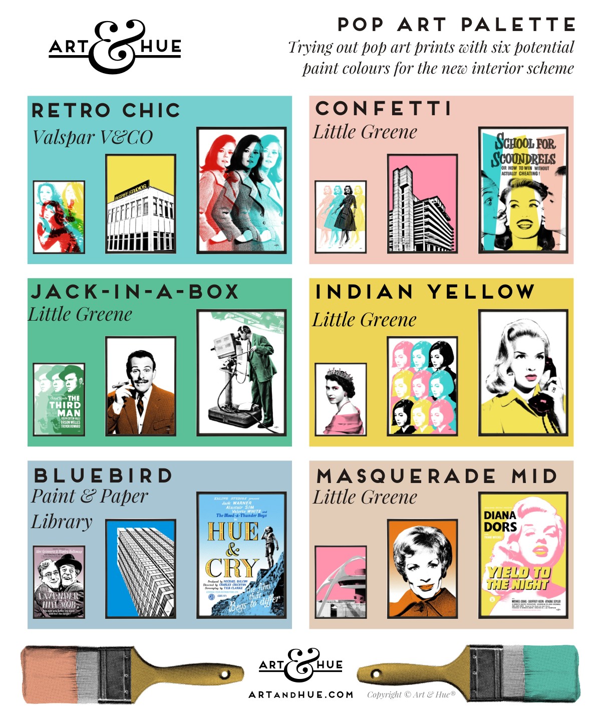
Trying out pop art prints over paint colour backgrounds. Paint colours pictured: Retro Chic (Valspar), Bluebird (Paint & Paper Library), Confetti, Jack-in-a-Box, Indian Yellow & Masquerade Mid (all Little Greene).
Pop art pictured: Mrs Peel Titles, Elstree, Triple Emma; The Lavender Hill Mob, South Bank Tower, Hue & Cry; Four Aprils, Trinity Square, School for Scoundrels; The Third Man, Terry-Thomas, Cameraman 1; The Queen, Nancy Nine, Diana Dialling; LAX Airport, Yootha Joyce, Yield to the Night.
Sample pots are only one step of the colour journey; the painted sheets will now be moved around rooms to see how they interact with natural and artificial light and complimentary sample pots may be called in.
But there’ll be no quick decisions – aside from some basic snagging and remedial work needed to be done first (the landscapers are currently drilling gate posts into the brickwork of the house this very moment – and later this week the tree surgeons will be operating on the oak and the birch), am “listening” to the house with the changing light to work out what it wants or needs.
For more paint & decor updates, make sure to subscribe to the newsletter.