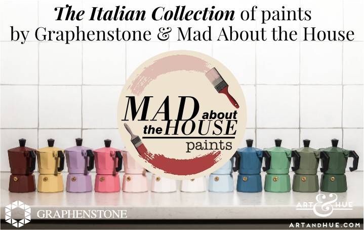
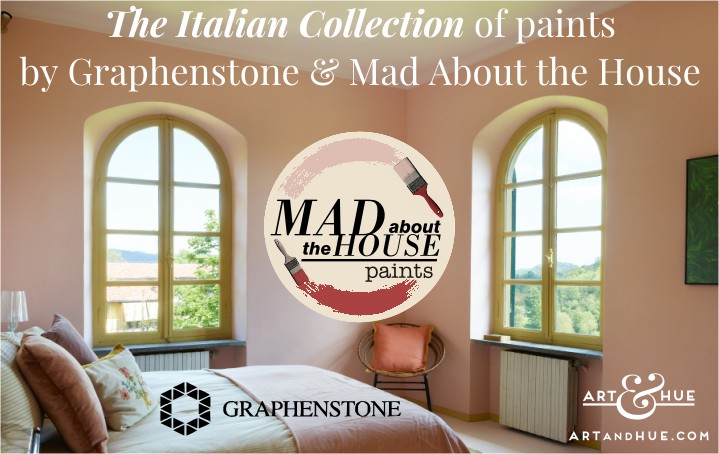
The Italian Collection of paints by Graphenstone & Mad About the House
UPDATE: Graphenstone has ceased trading in the UK but will keep this blog post online as Mad About the House’s colour palette may re-emerge with another paint manufacturer.
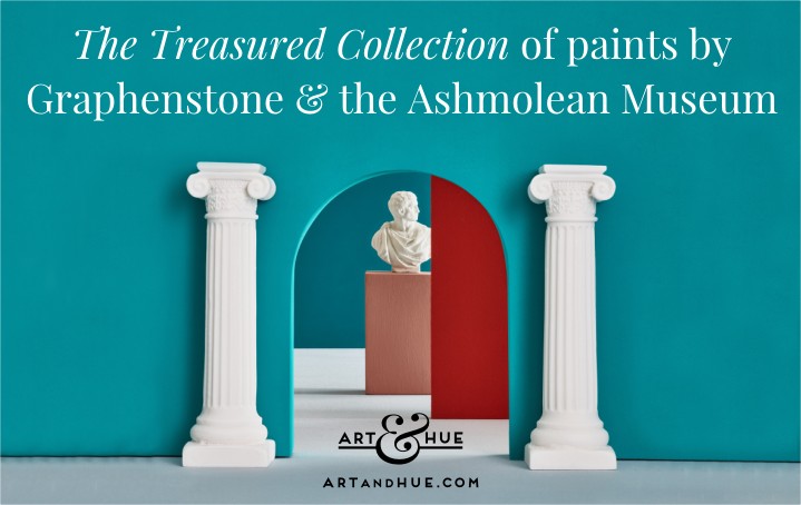
The recently-launched Ashmolean pop art collection, inspired by the Oxford museum, uses 12 colours from The Treasured Collection of paints by Graphenstone, rather than Art & Hue’s signature palette.
With the branding & website designed by Art & Hue, Mad About the House is the award-winning blog by interiors writer and journalist Kate Watson-Smyth.
Besides writing books, regular blog posts, newspaper & magazine articles, Kate also consults on interior projects & product collaborations, all while decorating her new London home (take a look at the recent reveals of her London kitchen and bathroom).
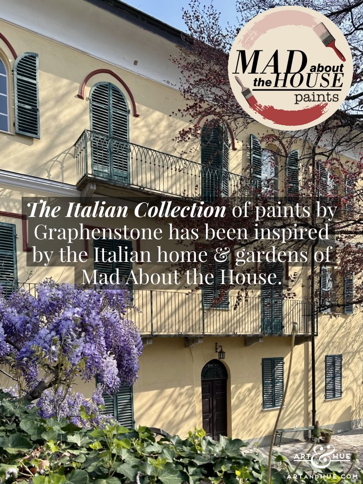
As if that wasn’t enough, and it’s a mystery where she finds the time, Kate and her husband also took on a six-bedroom villa in the Italian countryside of Piedmont. After months of renovations, images of the completed villa outside of Turin are starting to emerge, decorated with new Graphenstone paint colours developed by Kate for her home in Italy.
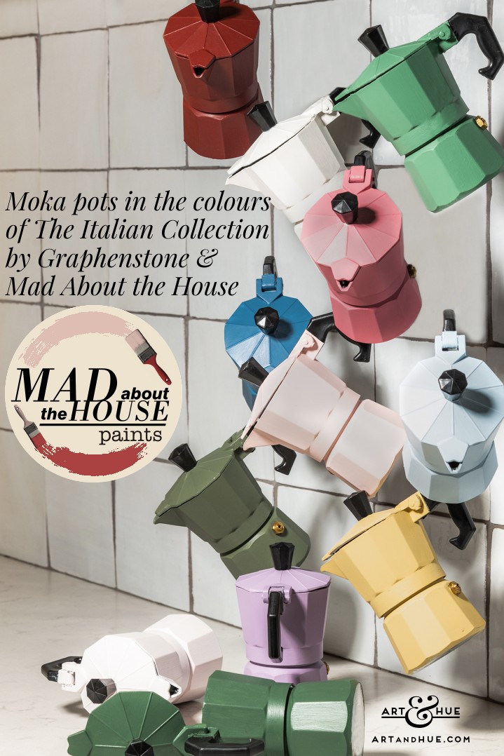
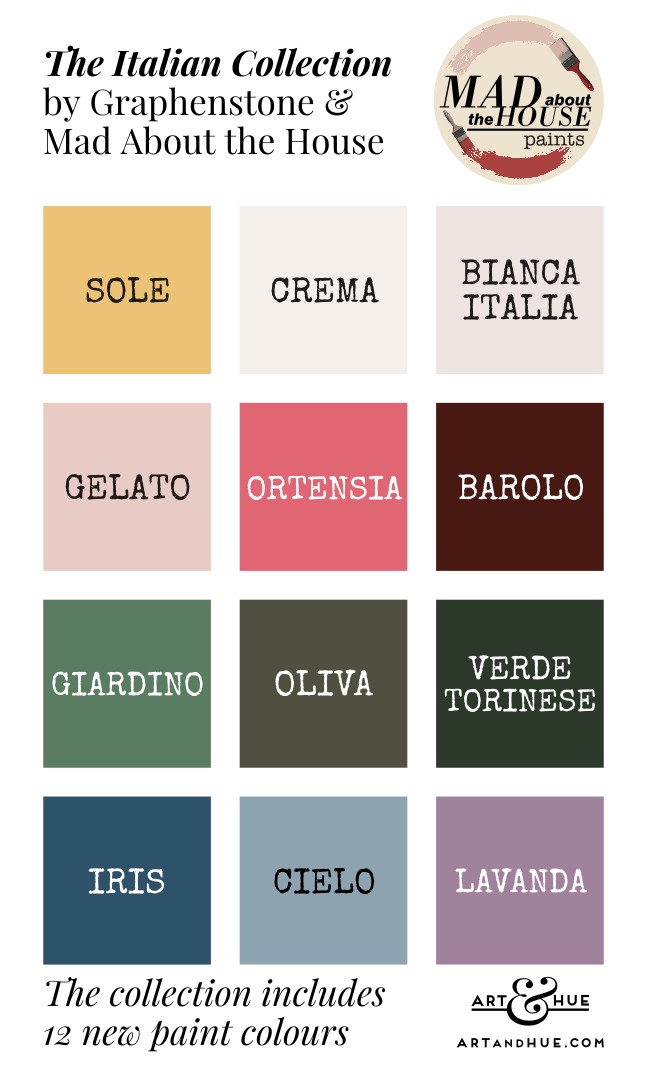
The Italian Collection of 12 paint colours combines the deeply romantic shades of Northern Italy with the softer tones of the British countryside, a palette that has been carefully designed for multiple combinations to suit every interior, regardless of location.
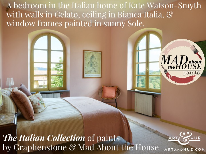
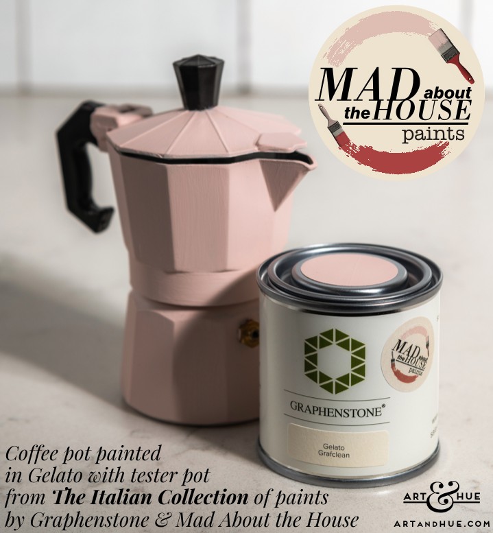
Each colour is inspired by Italy: Barolo is the deep chocolatey red of the famous Piedmont wine; Gelato is a soft ice cream pink; Ortensia, Lavanda, Iris, Oliva and Giardino reflect the vibrant hydrangeas, dense shrubs, and 100-year-old Wisteria of the villa’s gardens; Verde Torinese references the darker forest shades of the surrounding hills; Cielo is a sky blue; and Sole is a soft vintage yellow.
As Kate Watson-Smyth of Mad About the House says “each colour in this palette is inspired by our love of Italy, a celebration of the passion, style, and joy it has brought to our lives. The colours work alone or equally well together in Britain where the light is a little cooler – bringing a softer, romantic and sensual palette to the interior”.
“To create a bespoke palette of colours inspired by my very own Italian home and in a paint that is kind to both people and the planet is a dream come true, the perfect scenario”, Kate adds.
Available in Matt & Eggshell finishes.
Graphenstone paints use graphene which is the strongest material currently known, discovered in 2005 by two Nobel Prize winners at Manchester University, Sir Andre Geim and Sir Kostya Novoselov.
The inert, innocuous & nontoxic pure carbon enhances hardness, durability, tensile strength, elasticity, and paint coverage. Combined with lime, Graphenstone’s wall coatings ensure that walls can breathe to improve air quality, reduce humidity & condensation, and deter bacteria & mould.
Considering the paint industry at large is one of the main polluters on our planet, with larger brands selling plastic vinyl paints, Graphenstone are doing their part to be eco-friendly – in fact they’re possibly the most eco-certified paint company in the World.
The environmental impact of manufacturing the paints is rigorously controlled, powered entirely by renewables (with waste water being reused in the production process) – all packaging is cardboard, and the paint tubs are made using 100% PCR plastic (post-consumer), meaning everything is 100% recyclable.
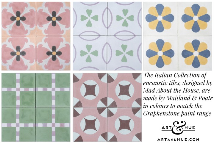
Based on reclaimed tiles Kate saw at a salvage yard, the tile collection includes heritage designs that have been refreshed and reinvented with the new colour palette. Inspired by her recent renovation of her Italian home, each pattern is named after one of the rooms in Kate’s house and the colour choices have been influenced by the 300-year-old property’s original features and matched to the new paint collection with Graphenstone.
Encaustic means the colour runs right throughout the tiles vertically, not just printed on the surface, so they will last for many lifetimes of wear.
As well as The Italian Collection with Mad About the House, Graphenstone has collaborated on paint collections with others including the recently-launched edit by Michelle Ogundehin (the previous editor of Elle Decoration magazine who judges “Interior Design Masters” on BBC Two), Tim Gosling’s Restoration Chateau collection, interior designer Rose Uniacke, and The Treasured Collection with the Ashmolean Museum.
Art & Hue redesigned Kate’s blog Mad About the House in 2015 and applied a “tweakment” last year to placate the seemingly ever-changing technical requirements of the internet and new devices.
After almost 12 years of writing free blog posts, Kate has recently made the move to Substack where online writers can be actually compensated for their valued content.
It’s great to see Kate thriving on Substack with thousands of subscribers keen to keep up with her informative witty posts, and benefit from her many years of interiors knowledge and experience.
As well as designing the logo & blog, Art & Hue designed the new paint collection’s branding in collaboration with Mad About the House, using a pop art brush, which is applied to the paint pots in The Italian Collection.
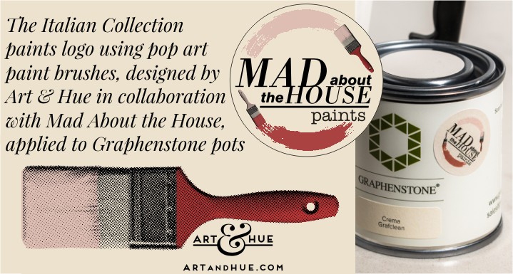
Incidentally, finding paint colours to match the Art & Hue palette has proved tricky – the nearest match I’ve seen is Graphenstone’s Jaipur which is close to Art & Hue’s Verdigris but slightly bluer.
To paraphrase a Julie Walters character in Victoria Wood’s TV show, I’ve scoured the internet from top to bottom – can I find a custardy egg-yolk hue that matches the Art & Hue yellow? Can I buffalo!
However, they don’t have to match. Different shades from the same family can add tone-on-tone interest.
As Kate first wrote on her blog many years before the recent “unexpected red” trend, it’s also impactful to have a “disruptor” colour, something unexpected to catch the eye and season the other colours, like a dash of lemon & salt on food.
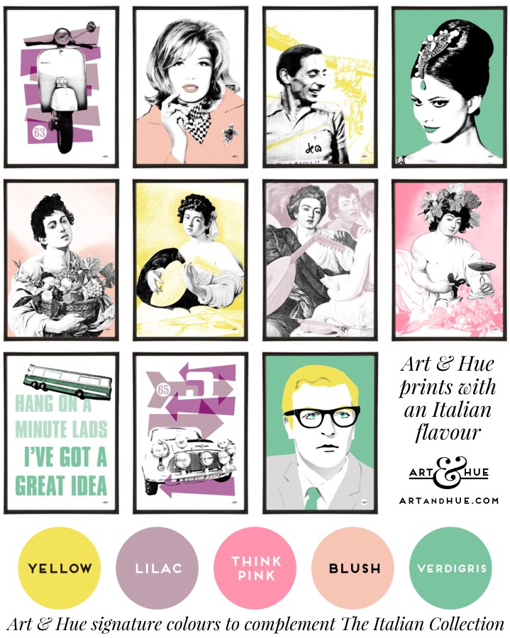
So whilst the Art & Hue colours of Blush, Think Pink, Yellow, Verdigris & Lilac aren’t exact matches for The Italian Collection’s Gelato, Ortensia, Sole, Giardino & Lavanda, they’re in the same gene pool, but you may want to opt for a “disruptor” hue of Emerald Green, Cyan, or zesty Orange.
Fausto Coppi is the Italian hero nicknamed “Il Campionissimo”, Champion of Champions, who won the Italian Giro five times and the French Tour twice. Hailing from the same region as Mad About the House’s Italian home, the Piedmont town of his birth was renamed Castellania Coppi in 2019 to recognise his achievements.
One of Italy’s most famous actresses, Claudia Cardinale’s role of Princess Dala in “The Pink Panther” brought her to the attention of international audiences as the jet-set socialite holidaying in the ski resort of Cortina d’Ampezzo.
The Fiat building with the rooftop racetrack, which the minis use in the film, has been converted to a hotel so, if you find yourself on one of Mad About the House’s design retreats at their Italian home, you can explore and stay at the significant location.
The Italian Collection>
Now we’re in a thoroughly Italian mood and inspired by all the moka coffee pots painted in The Italian Collection’s colours, it’s time for an espresso and an amaretti (or two).
In the meantime, you can see more images of the Italian villa which, as I type, have just been released into the wild on Kate’s Substack here.
To read about more Graphenstone paints, visit here to discover the The Treasured Collection in collaboration with the Ashmolean Museum.