Paint Sampling Continues…
Yes, the hunt for the perfect paint colours for the new house is ongoing, with more sample pots being called in to be slapped on sheets of card and moved around rooms to see how they play with the light.
Full disclosure: as in the previous paint sampling post, some sample pots have been bought, at full price or with trade/press discount, and some have been received free of charge for review, but all are being assessed objectively without bias to decide which are most suitable. As they say on social media: hashtag ad, #ad
Regular blog readers may have seen the first paint post (online here) which has led to more sample pots to compare (and possibly more after this batch!) but, like the saying goes, “measure twice, cut once”, or in this case “sample twice, or thrice, and paint once”, so aiming to get the colours just right to save redecorating again in a couple of years.
Not that redecorating with a slap of paint is that much of a hardship (in regular-shaped rooms, stairwells are a different matter) – many like to change up their interior paint colours regularly to refresh a room and purely because they fancy a change – but, after shuffling boxes and furniture around from storage unit to storage unit for roughly five years whilst house-hunting (so many boxes that need sorting, filing, recycling, ebaying, or donating ahead of picking up a paint brush, in between printing pop art of course), now everything’s settled in the new home, the hope is to paint once (for a good while anyway, until inspiration strikes to change things again).
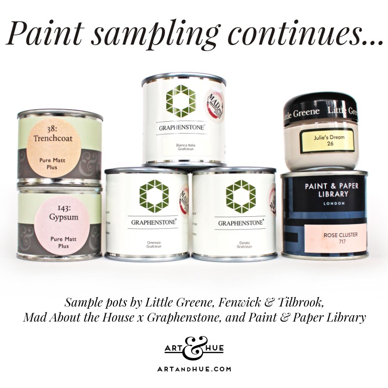
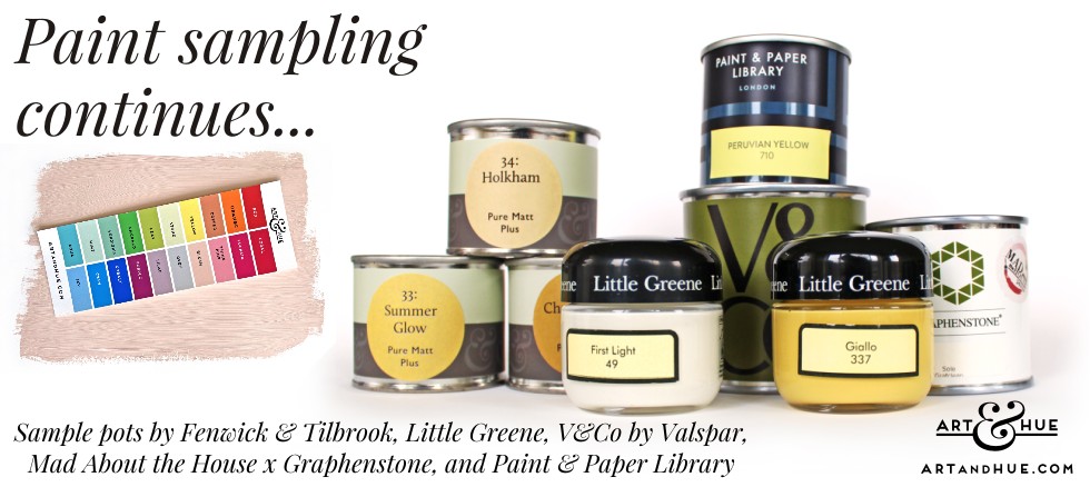
For this round of sampling, paints are from Little Greene, Paint and Paper Library, V&Co by Valspar, the Mad About the House collection, and Fenwick & Tilbrook. All manufacturers produce paints with low VOCs (volatile organic compounds) so don’t have the nasty headache-inducing odours of old traditional paints.
The plan is to steer away from greens (none of this “bring the garden in” thinking, the garden can stay outside to look at thank you very much, and green can be provided by pot plants) so, as the scheme of aquas, pinks and yellows was in mind ahead of moving in, the deliberation is underway to decide which (if any) will work with the daylight here (as well as artificial light at night – some paints look great in the sun and just turn to grey at night once the table lamps go on).
There are some great colours that would all work in the right space, the judgement is whether it’s your space or not. There are so many colour choices out there that whilst it might seem a shame to stick with whites, taupes or greiges, if your space is crying out for a neutral background, then you’ll know. (For all the paint colour sampling, Loft White by Little Greene is a great clean brightness the exact shade of the Art & Hue archival cotton card used for printing pop art, albeit with a bonus brightness from the paint’s minerals, and First Light is white with a touch of yellow to warm up a room subtly so bearing them in mind).
Fenwick & Tilbrook
Firstly let’s take a look at the range by Fenwick & Tilbrook. Based on the outskirts of Norwich, this paint company has a wide range of great colours to choose from, many named after places in Norfolk which is a charming touch. Let’s take a look at the paints sampled:
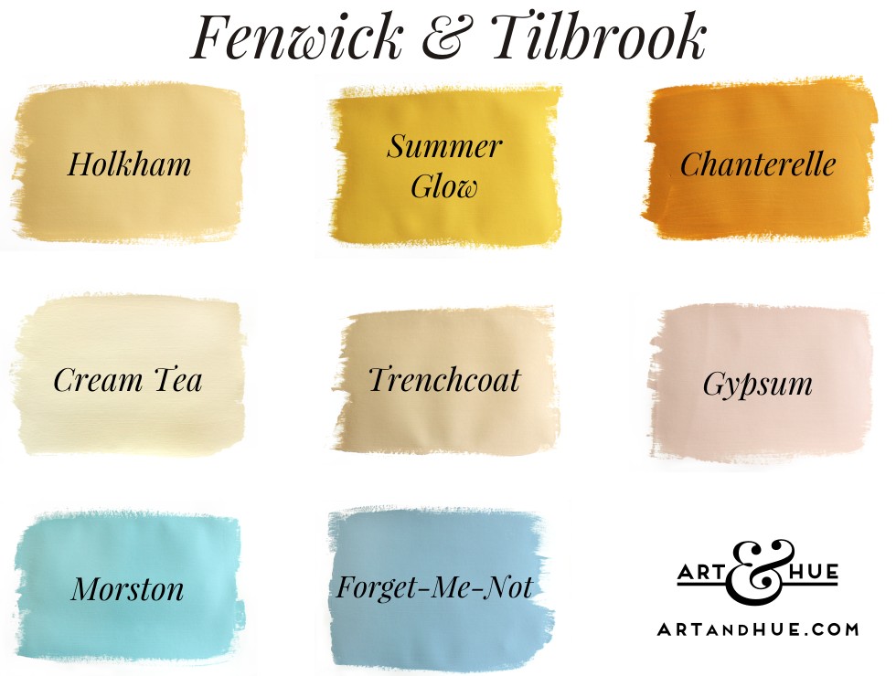
Holkham – like flaxen straw, it’s a pale yellow with a touch more red than other similar paint colours so adds more warmth and interest than a pedestrian beige or magnolia.
Trenchcoat – named after the ubiquitous macintoshes, like Harry Palmer’s in “The Ipcress File”, this paint colour is a revelation; like pale cardboard boxes, manilla envelopes and latte foam (all good things), that could be incredibly versatile to use anywhere where you need a neutral yet warm background.
Morston – hitting somewhere between an aqua and blue, the clean and fresh shade evokes bright sunny beach days by a clear sea. Whereas some blues can be too cold, the touch of yellow to shift the colour towards turquoise makes it warmer and highly versatile.
Forget-Me-Not – like Wedgwood Jasperware, this blue is so usable in any space, it’s practically a neutral. Ideally for rooms with good light, or heating, as blues might feel colder in certain spaces (not necessarily darker rooms where it can feel cocooning but rather because of the light if it’s a cold Northern aspect), it’s a great choice to layer other colours on top of with art and furniture.
Gypsum – a delightful soft powdery plaster pink, quite pale so not overwhelmingly “princess bedroom”, would bring a joyful bright warmth to a space.
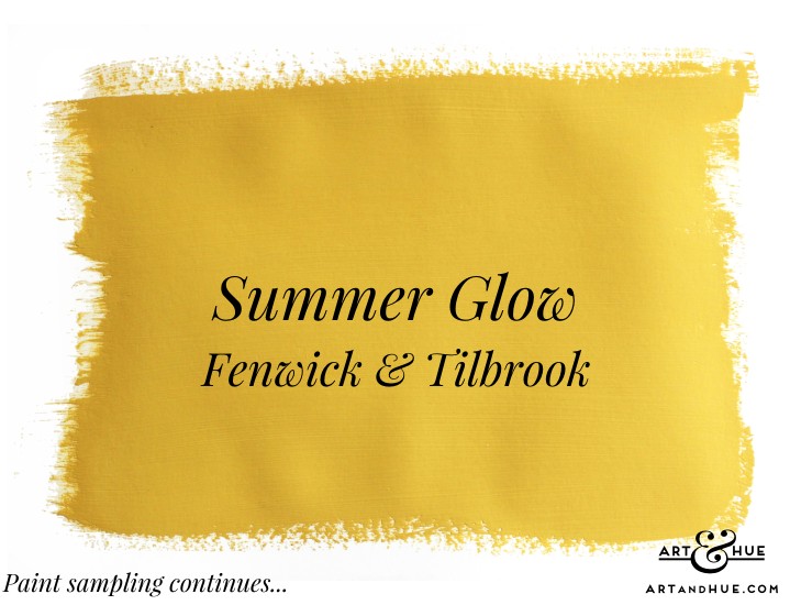
Summer Glow – This yellow has been a pleasant surprise: if there was ever a yellow that was a “blind buy”, this would be it (but would always recommend sampling first). If you’re looking for a bright yellow, as opposed to a mustard, it looks the perfect shade that should work in any space – it’s not too green, red, orange, grey, or brown – it’s not too light or dark – it’s not too acid or dull – it’s the perfect bright sunny yellow that would bring happiness to any wall.
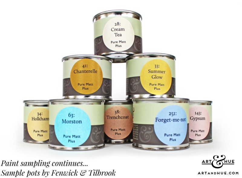
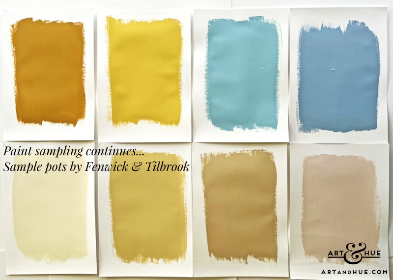
Chanterelle – a rich ochre but with a touch more warmth than many mustard paints, ideal for bright rooms where a traditional mustard colour may come across as too dull or green.
As well as the colours sampled above, Fenwick & Tilbrook have a wide range to choose from including some beautiful vintage lilacs that are most appealing.
V&Co by Valspar
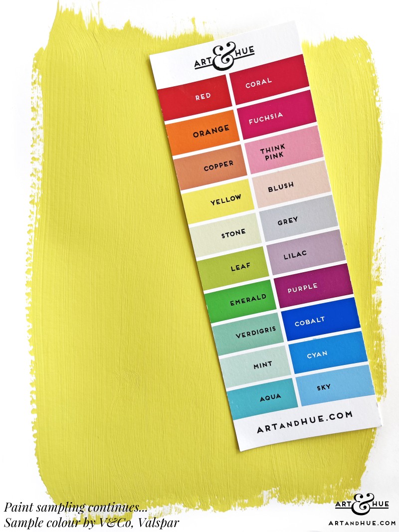
Next briefly on to Valspar. I mentioned in the previous paint sampling post that they offer the service of colour-matching anything you take in to scan at your local branch of B&Q so had high hopes (incidentally, their colour name for a lovely pale turquoise) that they’d be able to replicate the Art & Hue yellow in paint form.
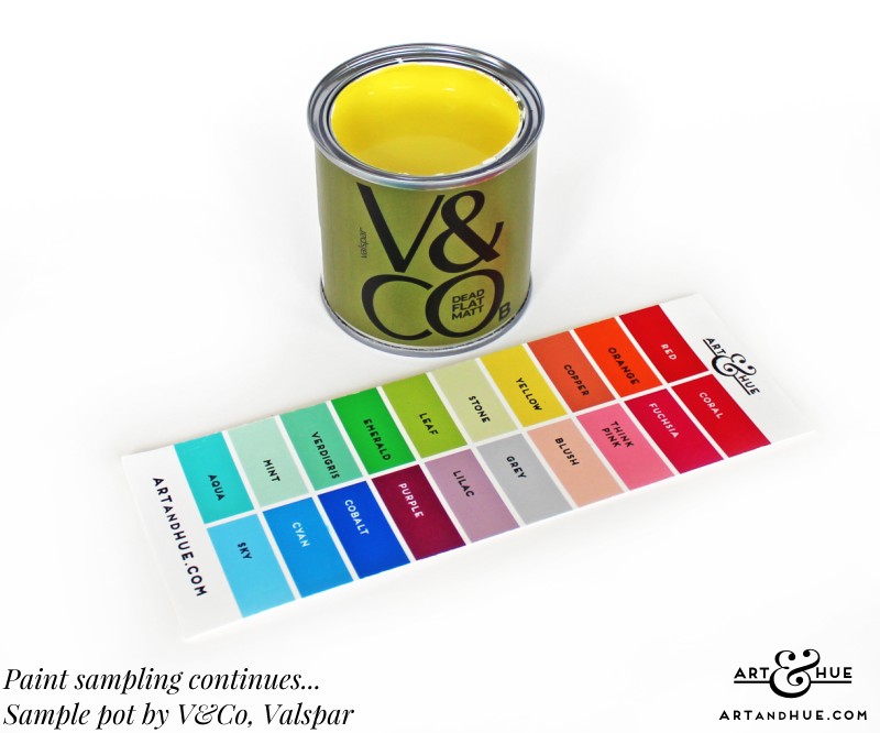
Their colour-match isn’t quite there with the sample pot coming out too green and dark – whilst the Art & Hue yellow is a bright tone, it has a golden custardy warmth to it that the Valspar scanner wasn’t able to capture.
So the hunt goes on although, unless another paint company is able to try and match the Art & Hue yellow, just might have to admit defeat in finding the ideal match and work with a complimentary yet different yellow instead.
Little Greene’s Indian Yellow (darker and greener than the Art & Hue yellow) or Giallo (darker and more orange) are in the same family so should work alongside the Art & Hue yellow and help the pop art to stand out.
Mad About the House x Graphenstone
Now to Italy (figuratively) with Mad About the House‘s collection of paints for Graphenstone (previously blogged about online here).
Just to mention ahead of looking at the selection of paint colours sampled, Art & Hue designed the little sticker with the pop art brushes applied to all the Graphenstone pots in the Mad About the House range (and it’s great to see them looking adorable on the labelling).
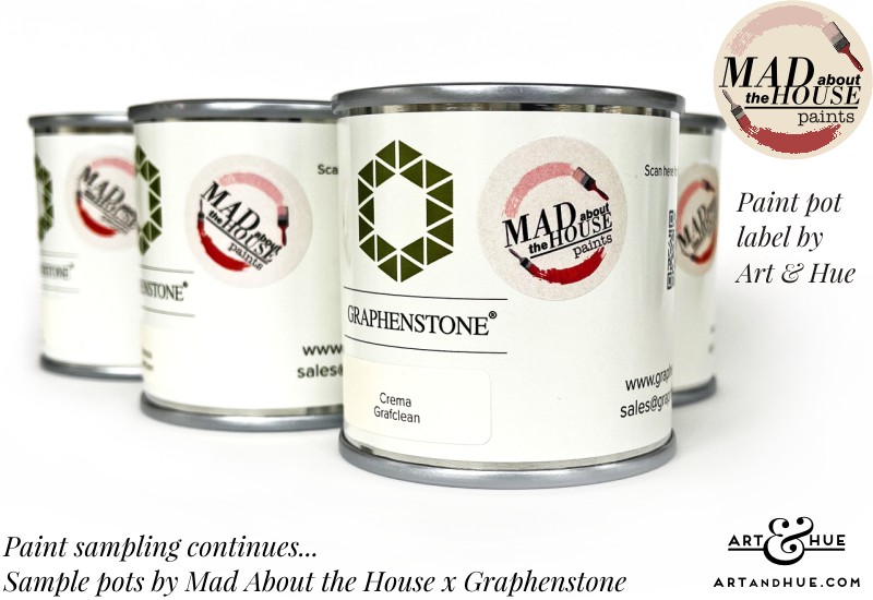
Kate Watson-Smyth, the writer and journalist behind the award-winning blog Mad About the House, purchased and decorated a house near Turin and turned to Graphenstone to create her ideal range of paint colours for the Italian property.
From soft pinks to dusty blues and verdant greens, the range has been used extensively throughout her Italian home but, as they’re more muted than you might expect for Italian sunshine, they can also suit British weather.
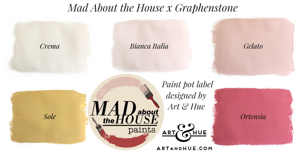
Bianca Italia – a very pale pink for rooms you want to keep bright but bring some warmth into.
Gelato – like strawberry ice cream, a soft pink with a hint of blush (close to the Blush pink by Art & Hue but with slightly more blue and less yellow).
Sole – a pale mustard that can read yellow in some lights, similar to Little Greene’s Madeleine from their Sweet Treats collection.
Ortensia – a deep raspberry puree for a powerful hit of colour, not for the faint-hearted but for those looking to add rich drama to a scheme – ideal for a striking wall (or ceiling as Kate has done in one of her Italian bedrooms) or a colour-drenched smaller room for warm cocooning.
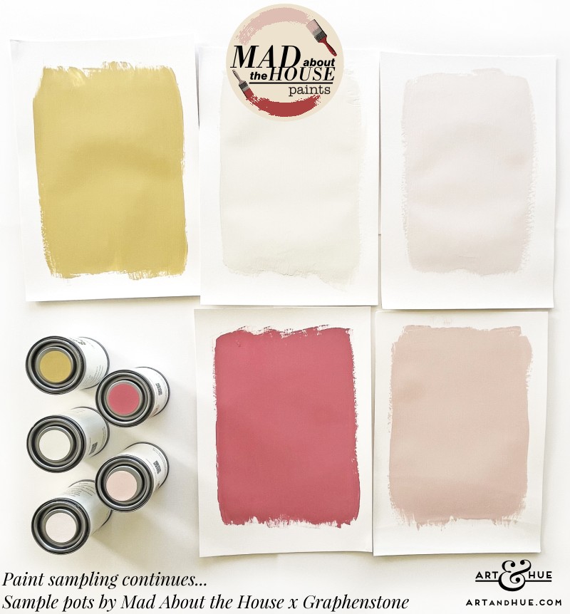
It’s a nicely balanced palette of colours inspired by Kate’s Italian home that should all mix and match well together. As well as the shades mentioned, there are greens, blues and purples so take a look at the full colour card to explore more.
Paint & Paper Library
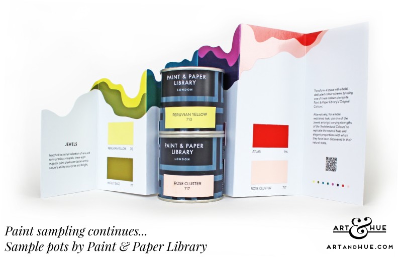
Peruvian Yellow is a pale yellow but with an acidic brightness that would bring real zing to a wall but, as it’s pale, not feel like a warning sign.
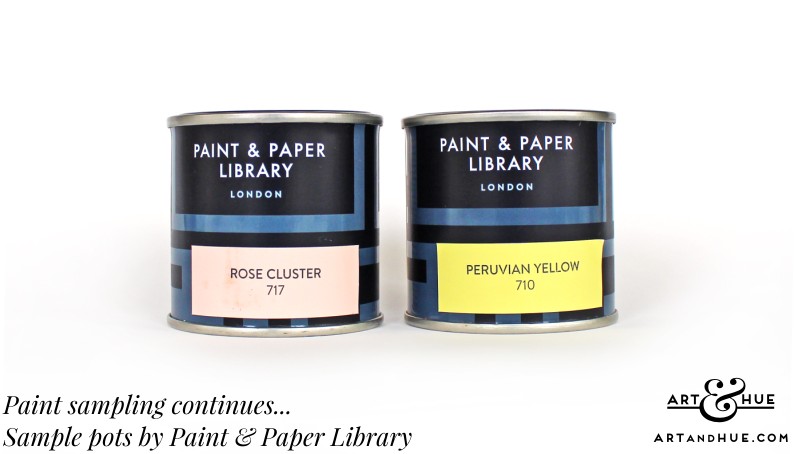
Rose Cluster is as close a match as any to the Blush pink option in the Art & Hue palette so it’s very exciting – the colour will have to be used somewhere as it’s so close. It’s got the warmth of the Art & Hue blush that can be missing from other soft pinks which sometimes edge towards blue rather than yellow.
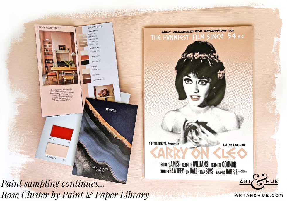
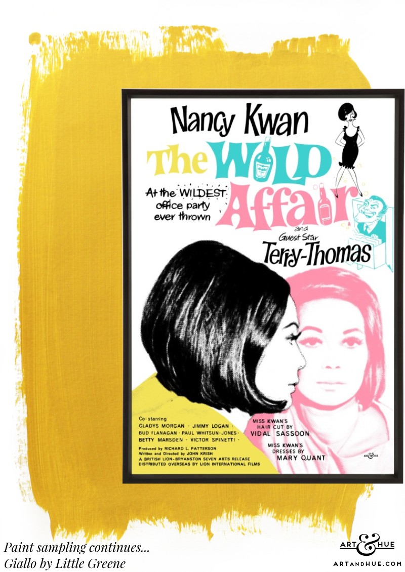
Rose Cluster paint colour by Little Greene with “Carry On Cleo” in Blush Pink.
Little Greene
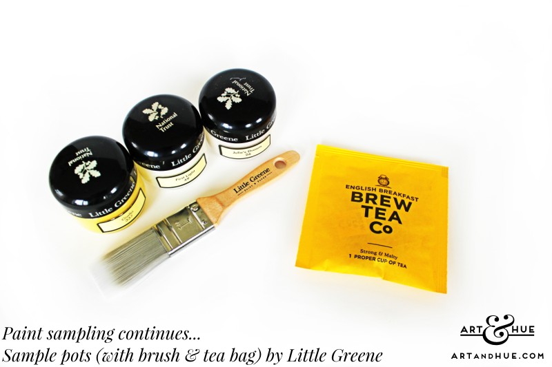
Last, but certainly not least given the tremendous range of colours, Little Greene paints. Having previously sampled a selection, as detailed in the previous blog post, more sample pots were gathered in to find the ideal shades, not just for walls but also for trimmings like ceilings and woodwork.
Aside from the glass sample pots looking stylish, Little Greene kindly include a small brush for painting swatches as well as a tea-bag to have a cuppa whilst you’re painting, a thoughtful touch that brings a moment of joy when unpacking the delivery of sample pots.
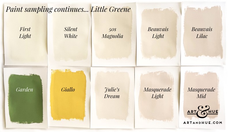
Firstly the paler shades to bear in mind for trimmings and rooms that are crying out for neutrals, like First Light, Silent White, 50s Magnolia, Beauvais Lilac, Light Beauvais, Julie’s Dream, Masquerade Light & Masquerade Mid.
All great neutrals, some veering towards yellow, others nudging closer to pink, they’re easy shades that could work anywhere – the tough decision is deciding where. The Beauvais & Masquerade colours in particular would look great in a bedroom – close to skin tones or the colours of foundation and powder, they would add more interest as a background than a regular white paint.
Firstly Garden was sampled just to be sure to rule out green – it’s a great colour that would work in many a room but not for here. Have never been one for “bringing the outside in” so green can stay outdoors (for now at least – personal tastes can change).
If the right pickle green, light olive, or lime leaf comes along, in the same colour family as the denim used in Junior Gaultier’s 1989 collection, then green might be an option in the future but, until then, green can stay outdoors in the garden to provide a difference to the interiors.
However, if you’re keen on green and are looking for the just-so shade of garden for the light in your room, call in sample pots of Garden by Little Greene as well as Giardino by Mad About the House/Graphenstone, and Invisible Green by Edward Bulmer to compare.
Secondly, Giallo, a beautifully rich and deep yellow with more orange in it than some other yellows – in rooms where mustard might be too dark or beige or where brighter yellows might feel too chartreuse, Giallo straddles both perfectly to add that golden hour sunshine all day and night long.
Learning the garden’s colours
Excluding the failed colour-match, the sample pots by the above manufacturers are all great paint colours which would work in many a room – it’s all a matter of personal choice and deciding which shades work with the natural light in your home.
As mentioned in the previous blog post, the paint sampling is ongoing with particular attention being paid to the daylight. Having moved into the new home in October, there seemed to be no rays for months during the dark winter months and it’s only now that the sun and the garden are revealing themselves that decisions can be finalised.
Spring arrived with a surprise at the end of February when yellow daffodils with orange trumpets sprung up out of nowhere (which confirmed the presumptive colour scheme of yellow, aqua & pink with accents of orange) followed by the left-field blanket of small purple and cornflower blue flowers (colours not factored in previously). Other bushes are starting to bloom in white and fuchsia and there are more yet to reveal their secrets.
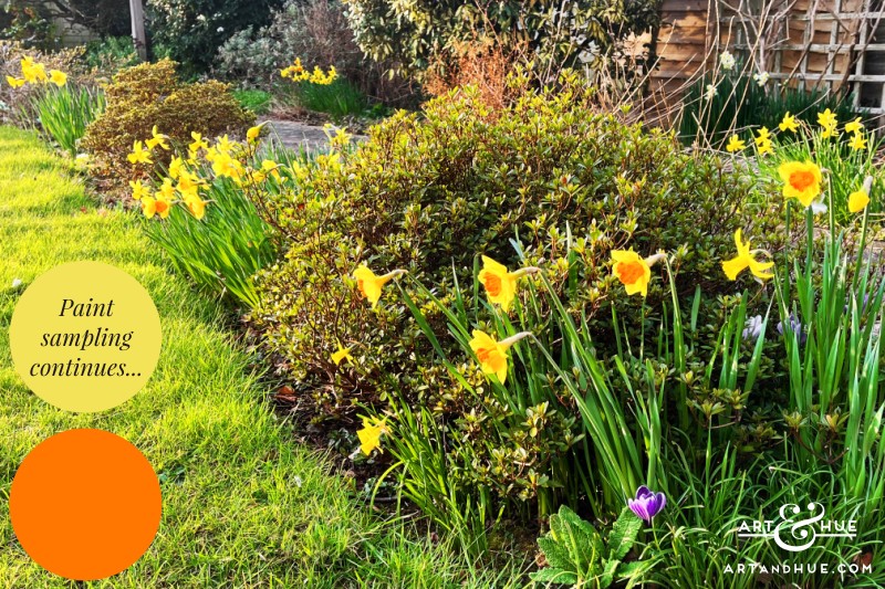
Thinned out by tree surgeons in January, and given a clean bill of health along with the oak, the 50 year old silver birch tree is beginning to produce leaves, and a fat little pigeon, in soft tones of lilac & grey, is conveniently tidying up any loose windfall birch twigs from the lawn to use in their nest in the large conifer – all pleasant as a view of the garden but also research before finalising the colour scheme and paint choices.
That’s the excuse for staring out the window anyway.
For future paint & decor updates, make sure to subscribe to the newsletter.